
Conversing with Contrast: Highlighting Elements, Boosting Differentiation, and Enhancing Legibility in Graphic Design
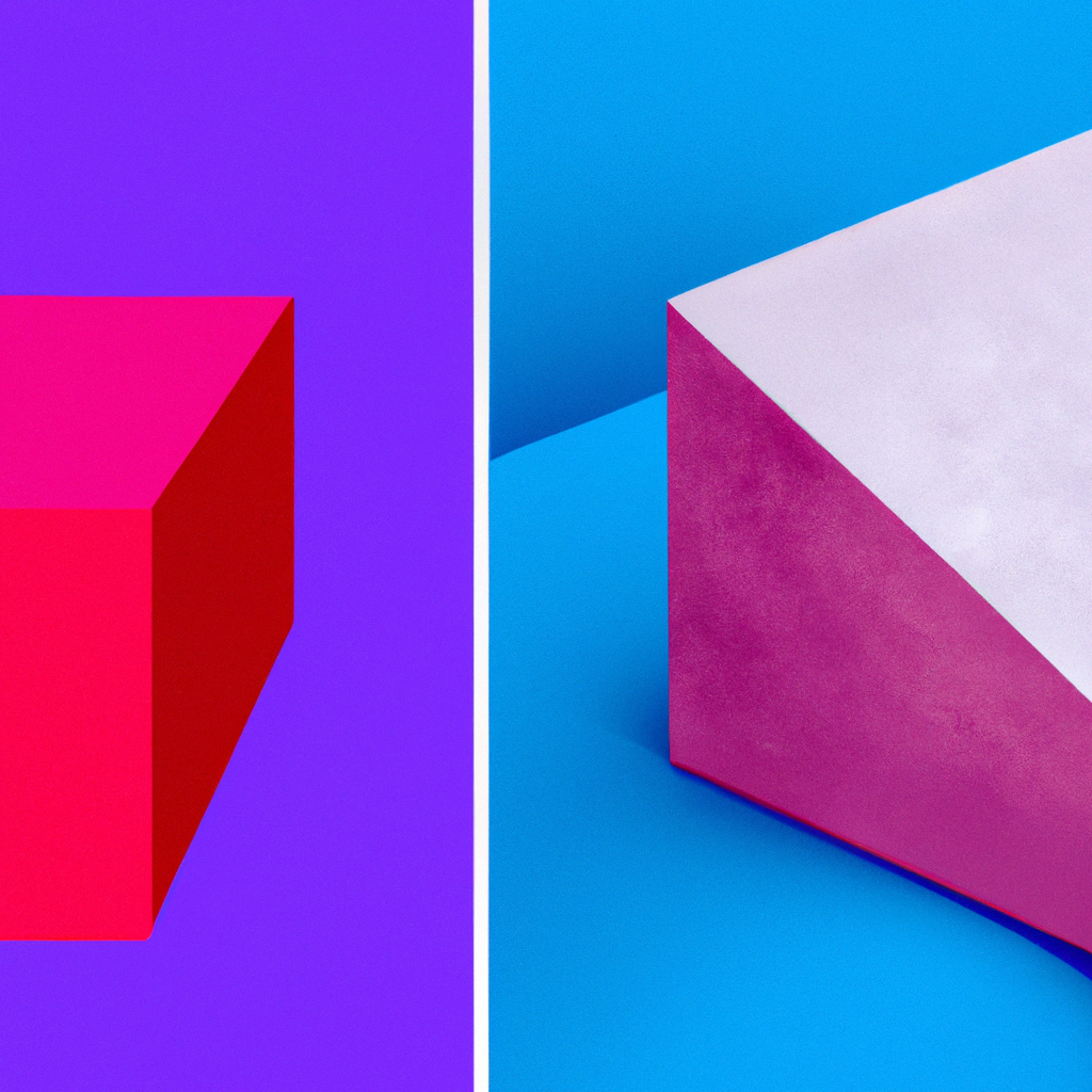
Contrast in graphic design highlights important elements, aids differentiation, and boosts legibility. Tips for incorporating contrast include color contrast, size and scale contrast, and texture and pattern contrast. Examples like movie posters and logos demonstrate the impact of contrast. Fully integrating contrast into designs amplifies visual impact. Let’s wield the mighty sword of contrast to create compelling designs that unify the viewer experience. Happy designing!
Colorful Conversations: Evoking Emotion, Boosting Branding, and Improving Readability in Graphic Design

Color in graphic design evokes emotion, boosts branding, and improves readability. Tips for designing with color include planning a palette aligned with the design’s purpose, balancing bright and dull colors, and using a consistent color scheme for a cohesive look. Examples like McDonald’s Golden Arches and Instagram’s logo showcase the magic of color. Navigating the realm of colors adds new horizons to design and creates visual symphonies that resonate with emotions. Let’s celebrate the rainbow of color in our designs. Happy designing!
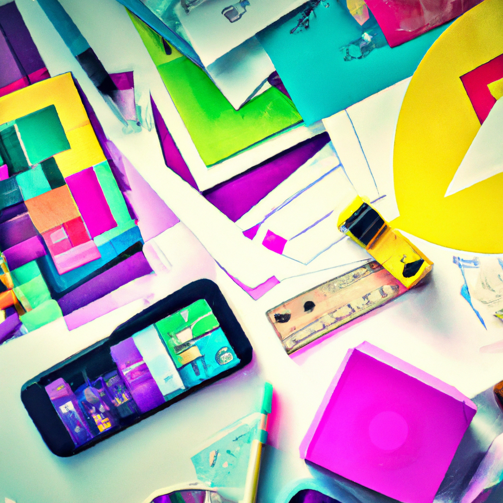
Mockup Challenge Day 24

Join me in the 100-Day Mockup Challenge! I’m creating an Adobe Photoshop mockup every day for 100 days. It’s a fun way to build up a product library and continue to explore new Photoshop tools.
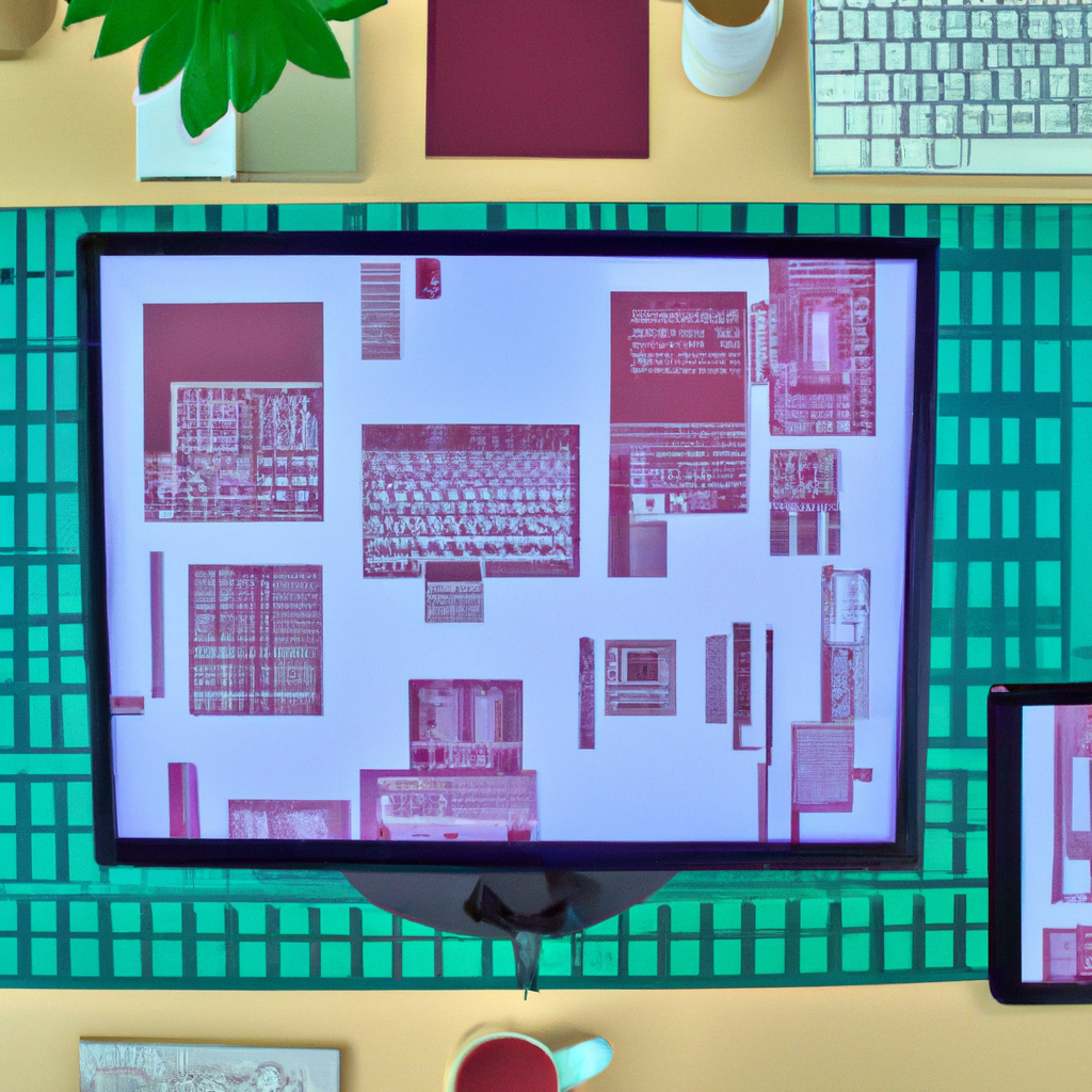
Mockup Challenge Day 23

Join me in the 100-Day Mockup Challenge! I’m creating an Adobe Photoshop mockup every day for 100 days. It’s a fun way to build up a product library and continue to explore new Photoshop tools.
Scaling Great Heights: Creating Emphasis, Enhancing Depth, and Mastering Visual Hierarchy with Size and Scale in Design
Size and scale in graphic design create emphasis, enhance depth, and aid visual hierarchy. Tips for utilizing size and scale include consistency, using large size for important elements, and using smaller scale for subtle details. Examples like 3D logos and infographics demonstrate the influence of size and scale. Embracing size and scale adds a new dimension to design and strengthens the narrative. Let’s master the magic of size and scale to create powerful visual stories. Happy designing!
Mockup Challenge Day 22

Join me in the 100-Day Mockup Challenge! I’m creating an Adobe Photoshop mockup every day for 100 days. It’s a fun way to build up a product library and continue to explore new Photoshop tools.
Crafting Personal Digital Spaces: Customizing Virtual Desktops for a Refined Computing Experience

Customizing virtual desktops offers organized, convenient, and productive digital spaces. Windows and macOS provide native support for virtual desktops, allowing customization of wallpapers, window arrangements, and display settings. Third-party tools like Dexpot and TotalSpaces2 enhance functionality. Dedicate each desktop to specific tasks, learn hotkeys for efficient management. Personalize your virtual desktops for an improved computing experience.
The Aura of Alignment: Creating Order, Improving Readability, and Guiding the Viewer in Design
Alignment in graphic design creates order, enhances readability, and guides the viewer’s eye. Tips for effective alignment include consistency, using grids and guides, and breaking from the grid for emphasis. Examples of successful designs showcase the beauty of alignment. Integrating alignment reshapes design aesthetics and brings balance and order. Embrace the power of alignment and turn chaos into harmony to create visually pleasing designs. Happy designing!
Mockup Challenge Day 21

Join me in the 100-Day Mockup Challenge! I’m creating an Adobe Photoshop mockup every day for 100 days. It’s a fun way to build up a product library and continue to explore new Photoshop tools.
Riding the Type Wave: Enhancing Readability, Creating Mood, and Strengthening Brand Identity through Typography

Typography in graphic design enhances readability, creates mood, and strengthens brand identity. Tips for using typography include sticking to a limited number of fonts, aligning text purposefully, and emphasizing important elements through contrast. Examples like Coca-Cola logos and successful websites showcase the brilliance of effective typography. Inviting typography into design gives a boost to creative expression. Let’s appreciate the power of typography and explore its potential to turn designs into engaging stories. Happy designing!
Mockup Challenge Day 20

Join me in the 100-Day Mockup Challenge! I’m creating an Adobe Photoshop mockup every day for 100 days. It’s a fun way to build up a product library and continue to explore new Photoshop tools.
Balancing the Scales: Guiding Focus, Enhancing Aesthetics, and Boosting Comprehension through Symmetry

Symmetry in graphic design guides focus, enhances aesthetics, and boosts comprehension. Tips for embracing symmetry include achieving perfect balance, employing the rule of thirds, and considering slight asymmetry for visual interest. Examples like the Apple logo showcase the elegance of symmetry. Integrating symmetry brings balance and charm to designs. Let’s employ the satisfying equilibrium of symmetry in our work and deliver engaging and comprehensible designs. Happy designing!
Mockup Challenge Day 19

Join me in the 100-Day Mockup Challenge! I’m creating an Adobe Photoshop mockup every day for 100 days. It’s a fun way to build up a product library and continue to explore new Photoshop tools.
Resonance of Repetition: Strengthening Consistency, Enhancing Coherence, and Boosting Recognition in Design

Repetition in design strengthens consistency, enhances coherence, and boosts recognition. Tips for mastering repetition include avoiding over-repetition, introducing variety, and aligning with brand identity. Examples like Adidas stripes and website backgrounds demonstrate the beauty of repetition in creating patterns. Embracing repetition as a design tool adds depth and creates a harmonious design. Let’s harness its potential to tell stories and create a visual rhythm that resonates with viewers. Happy designing!
Mockup Challenge Day 18

Join me in the 100-Day Mockup Challenge! I’m creating an Adobe Photoshop mockup every day for 100 days. It’s a fun way to build up a product library and continue to explore new Photoshop tools.
Unlock the Power of Macros: Streamlining Tasks for Enhanced Productivity

Macros offer a powerful way to streamline tasks by automating repetitive actions across software and devices. They can be applied to various platforms, including Microsoft Office Suite, gaming software, Android, and iOS. Excel and Word macros in Office Suite enhance efficiency, while gaming macros customize controls and automate tasks. Consider security risks and complexity when creating macros. Unlock the potential of macros for enhanced productivity and optimized workflow.
Finding the Flow: Enhancing Engagement, Guiding Audience, and Conveying Story through Movement in Design

Movement in graphic design enhances engagement, guides the audience, and conveys a story. Tips for instilling movement include using lines and curves, layering elements, and spacing and positioning objects. Examples like animated website banners and the FedEx logo showcase the impact of movement in designs. Embracing the concept of movement adds life to static designs and resonates with viewers. Let’s explore the potential of movement in our designs and create an engaging visual ballet. Happy designing!
Mockup Challenge Day 17

Join me in the 100-Day Mockup Challenge! I’m creating an Adobe Photoshop mockup every day for 100 days. It’s a fun way to build up a product library and continue to explore new Photoshop tools.
The Power of Simplicity: Boosting Clarity, Amplifying Focus, and Enhancing User Experience through Minimalism

Minimalism in design focuses on clarity, amplifies the central message, and enhances user experience. Tips include emphasizing essentials, utilizing whitespace, and simplifying complex ideas. Examples like Apple and Google showcase the impact of minimalism. Embracing the power of simplicity allows for more control over the narrative. Let’s embrace minimalistic design and create impactful designs by emphasizing the essentials. Happy designing!
Mockup Challenge Day 16

Join me in the 100-Day Mockup Challenge! I’m creating an Adobe Photoshop mockup every day for 100 days. It’s a fun way to build up a product library and continue to explore new Photoshop tools.