
Shades of Subjectivity: Guiding Interpretation, Gauging Impact, and Informing Design Decisions in Graphic Design

Understanding audience perception is a cornerstone of graphic design, as it shapes interpretation, gauges impact, and informs design decisions. Tips for crafting for perception include understanding demographics and psychographics, utilizing color influences, and incorporating semiotics. Examples like Coca-Cola and Apple demonstrate the importance of perception in successful designs. Let’s cultivate a deep understanding of audience perception and create designs that align with their perceptions. Happy designing!
Eclectic Icons: The Art and Fun of Personalizing App Imagery for a Unique Look

Customizing app icons is a popular method of personalizing devices, offering personal expression, visual harmony, and increased engagement. Customize app icons on iOS through the Shortcuts app or on Android using custom launchers or icon packs. Create your own icon set with design tools or choose visually coherent images. The future may bring dynamic icons and AI-generated suggestions for further customization. Embrace app icon customization to make your device a reflection of your personal brand.
The Palette Magic: Creating Mood, Defining Focus, and Reinforcing Brand Identity through Color Theory

Color Theory is a pivotal concept in graphic design that involves understanding the power of colors in evoking emotions, defining focus, and reinforcing brand identity. Tips for mastering Color Theory include harmonizing color schemes, balancing brightness and saturation, and considering accessibility. Examples like Coca-Cola and Facebook showcase the impact of colors on brand recognition. Immersing oneself in Color Theory transforms the outlook towards design, emphasizing the importance of visual communication. Let’s continue exploring Color Theory and confidently use colors to create visually exciting designs. Happy designing!
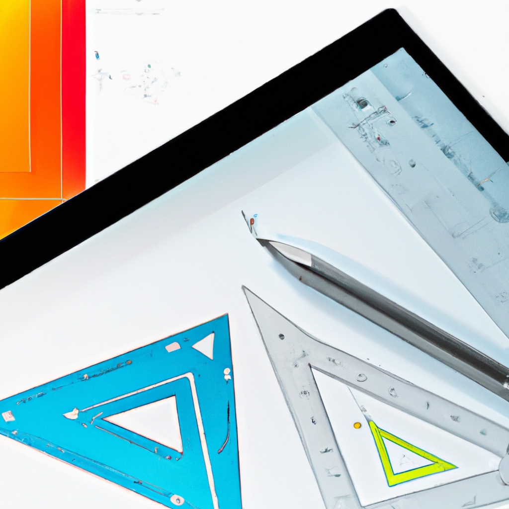
Mockup Challenge Day 15

Join me in the 100-Day Mockup Challenge! I’m creating an Adobe Photoshop mockup every day for 100 days. It’s a fun way to build up a product library and continue to explore new Photoshop tools.
Proportion in Practice: Achieving Balance, Guide Focus, and Enhance Aesthetics in Design

Proportion is a key principle in graphic design that provides balance, guides focus, and boosts aesthetics. Tips include using scale to highlight key elements, maintaining overall balance, and considering the Golden Ratio. Examples like the Instagram logo and book covers demonstrate the impact of proportion in successful designs. Embracing proportion enhances balance and effectiveness, adding visual rhythm to designs. Let’s unlock the power of proportion in our design repertoire and create harmonious designs. Happy designing!
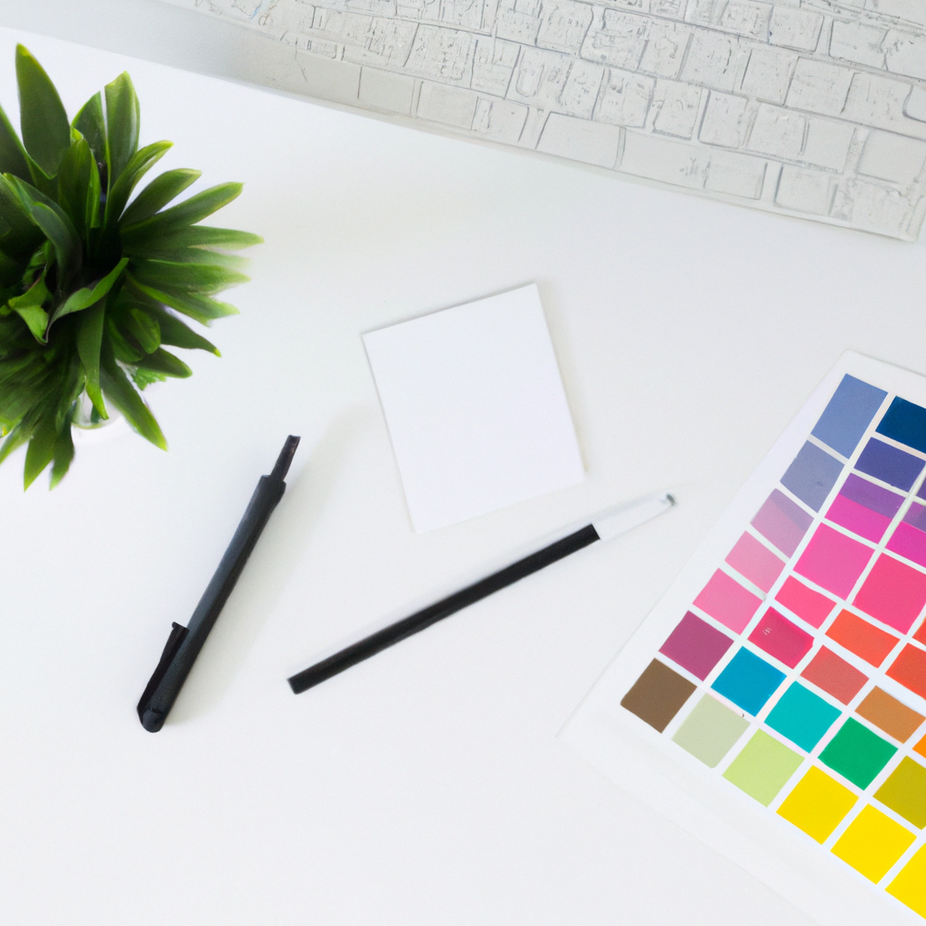
Mockup Challenge Day 14

Join me in the 100-Day Mockup Challenge! I’m creating an Adobe Photoshop mockup every day for 100 days. It’s a fun way to build up a product library and continue to explore new Photoshop tools.
The Art of Alignment: Creating Order, Improving Readability, and Guiding Focus in Design
Alignment is a vital principle in graphic design that creates order, improves readability, and guides focus. Consistency, using grids, and aligning to emphasize key elements are important tips for effective alignment. Examples like magazine spreads and mobile app interfaces showcase the impact of alignment in creating rhythm and balance. Embracing alignment brings balance and clarity to designs, bridging the gap between chaos and order. Let’s appreciate the art of alignment and create visually pleasing and effective designs. Happy designing!
Mockup Challenge Day 13

Join me in the 100-Day Mockup Challenge! I’m creating an Adobe Photoshop mockup every day for 100 days. It’s a fun way to build up a product library and continue to explore new Photoshop tools.
The Symphony of Hierarchy: Controlling Viewer’s Journey, Enhancing Readability, and Improving Aesthetics in Design

Hierarchy is a vital principle in design that guides the viewer’s journey, enhances readability, and improves aesthetics. Tips include using size to prioritize elements, employing bold colors to command attention, and utilizing white space to distinguish between elements. Examples like newspaper layouts and website designs showcase the impact of hierarchy. Incorporating hierarchy transforms designs into organized narratives that effectively communicate with the audience. Let’s integrate hierarchy into our work and create lucid and comprehensible designs. Happy designing!
Mockup Challenge Day 12

Join me in the 100-Day Mockup Challenge! I’m creating an Adobe Photoshop mockup every day for 100 days. It’s a fun way to build up a product library and continue to explore new Photoshop tools.
Efficient Work-From-Home Setup: Customizing Multiple Monitors for Hybrid Working

Using multiple monitors in a work-from-home setup can greatly enhance productivity and organization. Set up multiple monitors natively on Windows or macOS and use third-party tools for advanced customization. Consider screen placement and monitor angles for ergonomic comfort. Mastering multiple monitor setups can lead to an efficient and productive work environment.
Typography Talks: Conveying Tone, Aiding Readability, and Strengthening Brand Identity in Design
Typography is a crucial element in design that conveys tone, aids readability, and strengthens brand identity. Keeping it simple, using contrasting typefaces, and adjusting font sizes are key tips for effective typography. Successful typography is seen in logos, movie posters, and more, delivering a powerful impact on designs. Exploring typography reveals its ability to voice mood and intention, connecting with the audience. Let’s unlock the potential of typography and add depth to our design narratives. Happy designing!
Mockup Challenge Day 11

Join me in the 100-Day Mockup Challenge! I’m creating an Adobe Photoshop mockup every day for 100 days. It’s a fun way to build up a product library and continue to explore new Photoshop tools.
Amplifying Accessibility: Expanding Reach, Boosting User Experience, and Reflecting Empathy in Design
Embedding accessibility in design is crucial for fostering inclusivity. Accessible designs expand reach, boost user experience, and reflect empathy towards diverse user needs. Tips like considering contrast, providing captions, and simplifying navigation contribute to creating accessible designs. Examples from government websites, Apple, and Microsoft demonstrate the importance of accessibility. Embracing accessibility expands design’s potential and makes designers more socially aware and responsible. Let’s join together in designing accessible and inclusive experiences, reaching out to all users. Happy designing!
Mastering the Art of Nothingness: Enhancing Legibility, Guiding Focus, and Boosting Aesthetics with White Space
White space, often perceived as ‘nothingness,’ plays a crucial role in graphic design. It enhances legibility, guides focus, and boosts aesthetics. Balance, avoiding clutter, and prioritizing elements are key tips for effective use of white space. Iconic designs from Apple and Google showcase the power of white space in creating elegance and effectiveness. Embracing white space brings visual breathing room and user-friendliness to designs. Let’s explore the impact of white space and celebrate its contribution to design integrity. Happy designing!
Mockup Challenge Day 10

Join me in the 100-Day Mockup Challenge! I’m creating an Adobe Photoshop mockup every day for 100 days. It’s a fun way to build up a product library and continue to explore new Photoshop tools.
Dark Mode Customization: Transforming User Interface across Devices
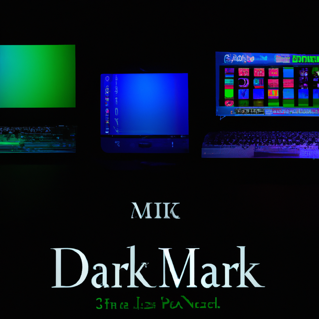
Dark mode customization has gained popularity across devices for its benefits, such as eye comfort and improved battery life. Activate dark mode on Android, iOS, Windows, and macOS with simple settings adjustments. Dark mode reduces eye strain, enhances focus, and saves battery on OLED screens. Expect the trend to expand to web design and offer more customizable options in the future. Embrace dark mode for a soothing and personalized user interface experience.
Gesture Design: Enhancing User Experience, Reinventing Interaction, and Endorsing Accessibility in Modern Design

Gesture design is a powerful concept in graphic design that enhances user experience, reinvents interaction, and promotes accessibility. Designing intuitive gestures, providing immediate feedback, and guiding users are key strategies for effective gesture design. Examples like touch-screen interfaces and motion-controlled gaming consoles showcase the impact of gesture design. Embracing gesture design elevates designs into interactive experiences, engaging and captivating users. Let’s explore the power of gestures in our designs and create intuitive and interactive experiences. Happy designing!
Mockup Challenge Day 09

Join me in the 100-Day Mockup Challenge! I’m creating an Adobe Photoshop mockup every day for 100 days. It’s a fun way to build up a product library and continue to explore new Photoshop tools.
Rule of Thirds in Graphic Design: Improving Composition, Enhancing Visual Interest, and Delivering Professional Results

The Rule of Thirds is a fundamental concept in graphic design that improves composition, enhances visual interest, and delivers professional results. Incorporating the rule involves using grids, placing key elements at grid intersections, and balancing the design. Successful designs, from advertisements to websites, utilize the Rule of Thirds to create profound visual narratives. Integrating this rule has enriched designs and effectively conveyed essential messages. Let’s embrace the Rule of Thirds to create compelling compositions that resonate with our audience. Happy designing!