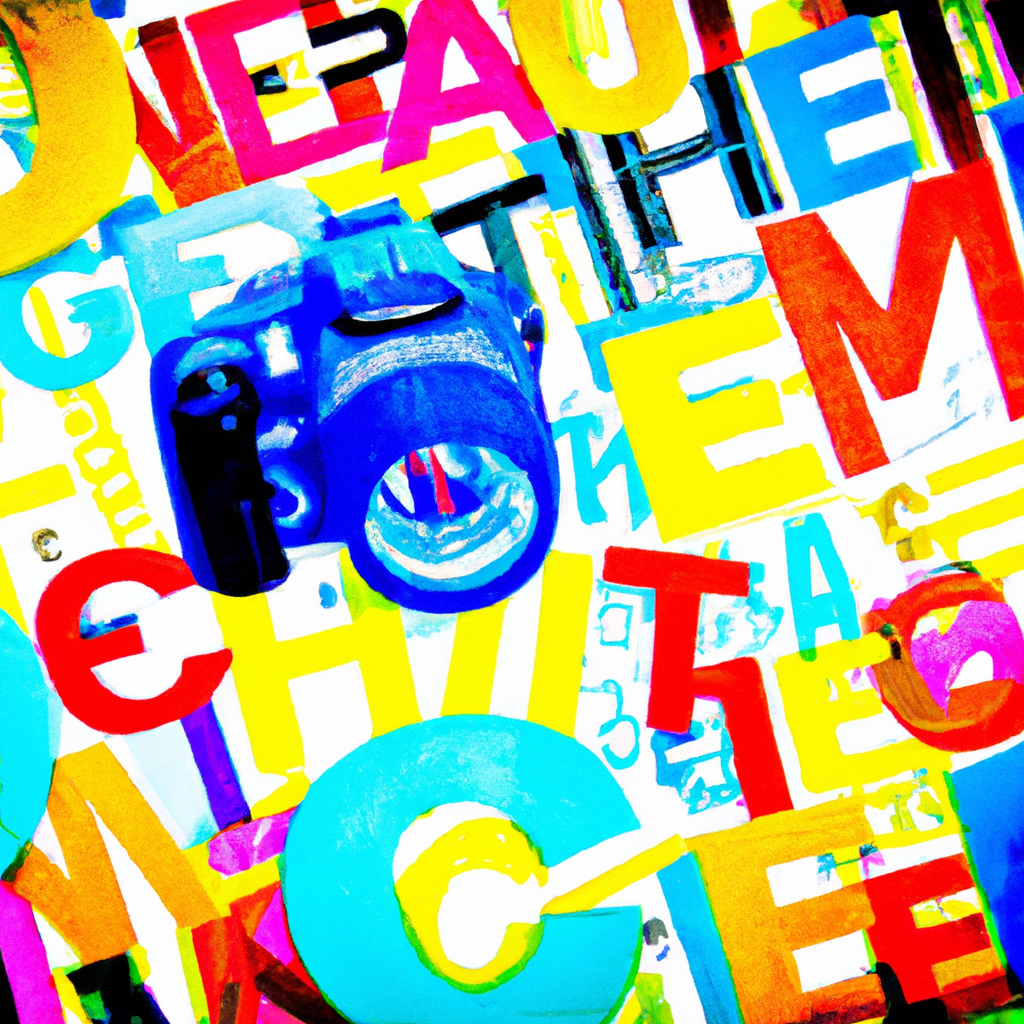
Typography Talks: Communicating Through Fonts in Design
Walking with Words: My Adventure
My journey into graphic design expanded my understanding of the inseparable bond between visual aesthetics and verbal communication. Amid these revelations, I discovered how typography – the art of arranging type – silently yet effectively conveys a design’s tone and intention.
Type Tells Tales: The Significance of Typography
But what makes typography such a crucial part of design? Here are my thoughts:
- Conveys Tone: Different typefaces can set different moods, supporting the message you want to convey through your design.
- Aids Readability: Legible typography ensures your content is easily readable and understandable.
- Strengthens Brand Identity: Consistent use of a specific typeface can be a part of your brand’s visual identity.
Transcribing Type: Tips for Effective Typography
Crafting beautiful typography is a skill that takes time and practice. Here are a few pointers from my journey:
- Keep It Simple: Avoid using more than two to three typefaces in a single design to ensure consistency and readability.
- Contrast is Key: Use contrasting typefaces for headers and body text to create hierarchy and enhance legibility.
- Sized Matters: Adjust font sizes according to their importance in your design narrative.
Type in Sight
Successful typography is ubiquitous – from the elegant typeface of The New York Times logo to the playful fonts adorning movie posters. It’s truly awe-inspiring how much a carefully selected and arranged type can deliver a powerful punch to any design.
Type as a Tool: My Revelation
Exploring typography’s terrain has been an enlightening expedition for me. I learned that fonts do more than just display words – they voice mood, emotion, and intention, weaving an invisible thread of connectivity with the audience.
To all the design enthusiasts out there, let’s continue to unlock the potential of typography in our designs. Let’s remember that in each letter, word, and sentence, there’s an opportunity to dot our design narrative with additional depth and appropriateness. Here’s to making our typography talk – and talk effectively. Happy designing!