Capturing Colors: The Spectrum of Emotions in Design
My Exploration into Colors
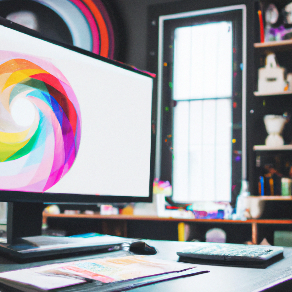
As I embarked on my graphic design journey, I was flabbergasted by the profound impact of one component – color. As I grappled with its alluring hues and shades, color emerged from being a simple beautifying factor to a powerful messaging tool that touched the heart of my visuals.
Colors and Their Serenade: Importance of Colors
But what makes color an indispensable part of design? Here’s what I’ve decoded:
- Stirs Emotions: Color has the power to evoke and manipulate emotions and perceptions, creating a more deep-rooted impact.
- Highlights Elements: Using contrasting colors can help highlight key elements in your design.
- Reinforces Brand Identity: Consistent use of specific colors can strengthen brand recognition.
Coloring Your Canvas: Tips for Effective Use
Mastering color use in designs calls for some mindful strategies. Here are a few:
- Understand Color Psychology: Different colors invoke different emotions. Understand your target audience and choose a color palette accordingly.
- Maintain a Uniform Palette: Consistency in colors across a design or a brand imparts an aesthetic as well as a professional charm.
- Contrasting Combinations: Strategic use of contrasting colors can make your design pop and attract attention.
Chromo Cosmos
Color usage done right is a sight to behold – be it the profound blue of Facebook or the energetic red of Netflix. It is the deft play of colors that makes a design engrossing and leads to the creation of memorable visual identities.
Palette Play: My Aha Moment
The more I played with colors, the more spellbound I became by their versatility. A single shift in the hue, and a design could go from sombre to vibrant, from serious to playful. Colors have hence been my silent allies – giving life to my designs and making them sing.
So, to you, my fellow designers, I say – let’s continue exploring the fascinating world of colors. Let’s make our designs not just presentations, but visual conversations that stir emotions. After all, in the realm of graphic design, every color carries a story, waiting to splash itself upon our canvases. Happy designing!