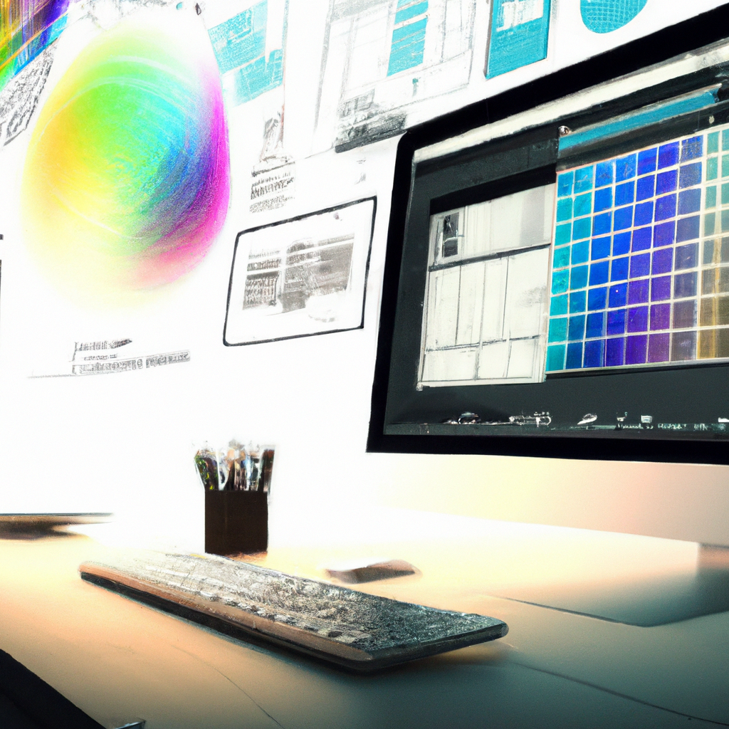
Color Code: The Impact of Color Psychology in Graphic Design
First Brush: My Journey into Color Psychology
My first foray into the exciting universe of graphic design was graced by an enlightening understanding – Color Psychology. This captivating concept, which steers how color choices influence perception, revolutionized my approach to design.
Spectrum of Influence: Importance of Color Psychology
What makes this colorful phenomenon a critical ingredient in the recipe of effective design? Let’s delve deeper:
- Mood and Interpretation: Colors affect mood and interpretation, giving designers a tool to steer the viewer’s emotional response.
- Increased Recall: Studies have shown that color increases recognition and helps memory retention, making designs more memorable.
- Brand Perception: The color scheme in a design can influence how a brand is perceived, shaping its identity and consumer impression.
Palette Picks: Tips on Color Psychology
Navigating the vast sea of color psychology requires an understanding beyond just picking colors. Here are my nuggets of wisdom:
- Know your Colors: Understanding what each color symbolizes helps you choose the right shades to convey your message.
- Consider your Audience: Colors have cultural connotations. Considering your audience’s background can ensure your choices don’t unintentionally offend.
- Simplicity Sells: Keep your color palette simple, usually not more than two or three main colors.
Color Choreography: Color Psychology in Action
The enchantment of color psychology can be seen in some of the most popular brands. Note how ‘Coca-Cola’ uses red for excitement or ‘Starbucks’ employs green for growth and freshness.
Coloring Thoughts: My Experience with Color Psychology
Targeting color psychology in my designs realized impactful narratives, making them not only visually appealing but emotionally engaging.
To my design companions, I encourage you to dance with the colors, understand their language, and let them sing in your creations. Let’s create designs that speak to the mind through the eyes. Paint on, artists! Happy designing!