Conversing with Contrast: Defining Elements in Graphic Design
Contrast: My Amplifying Discovery
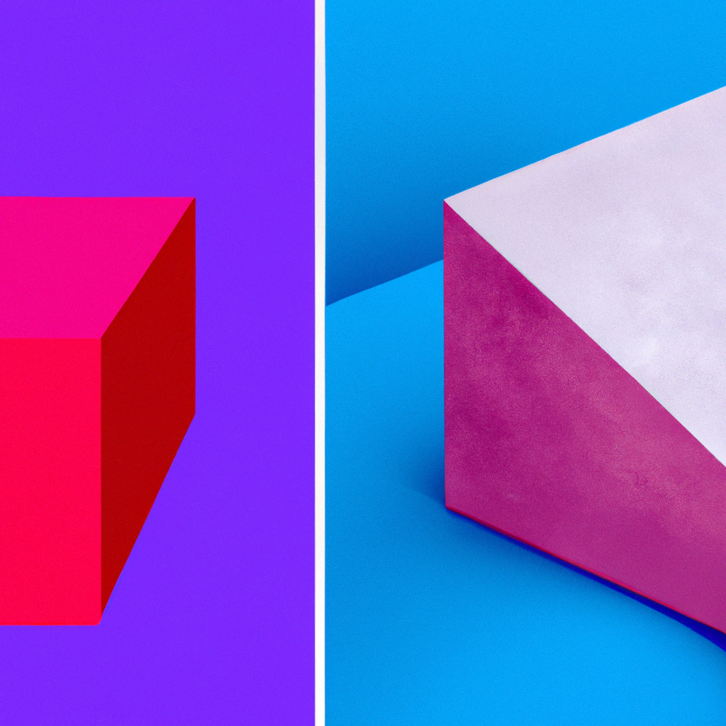
Throughout my graphic design journey, a special element that consistently gained my admiration was contrast. This seemingly simple strategy proved to be a powerful tool to highlight and synchronize my design elements, driving me to delve deeper into its various facets.
Contrasting Views: The Significance of Contrast
How does contrast contribute to the strength of your designs? Let’s break it down:
- Highlights Important Elements: Effective use of contrast draws viewer attention to key components of your design.
- Aids in Differentiation: Contrast helps distinct design elements stand out, making your design more visually interesting.
- Boosts Legibility: Proper contrast between text and background greatly enhances readability.
Creating Impact: Tips for Incorporating Contrast
Implementing contrast might appear straightforward, but it requires intentional thought and creativity. Here are some critical points to consider:
- Color Contrast: Utilize colors that stand out against each other to highlight specific areas.
- Size and Scale: Big elements contrast with small ones, furnishing a standout effect.
- Texture and Pattern: Varying textures and patterns can create an appealing visual contrast.
Contrast in Action
The impact of contrast ripples across countless captivating designs. Be it the strikingly contrasting typography in movie posters or the deliberate color contrast in logos, contrast is often the silent hero.
Contrasting Chronicles: My Design Evolution
Fully integrating the power of contrast into my designs amplified the visual impact in ways I had not foreseen. It acted like a spotlight, guiding the viewer precisely to where I wanted their attention.
So, to my design cohorts, let’s wield this mighty sword of contrast, sharpening our designs with clear narratives and compelling visuals. Let’s create designs that resonate, designs that speak, and designs that, amidst all diversity, unify the viewer experience. Get set and let the extraordinary journey of creating contrast continue. Happy designing!