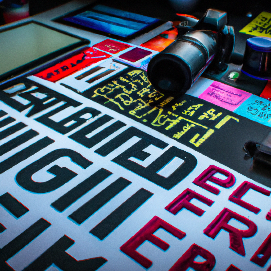
Typography Transforms: A Deep Dive into Font Pairing
Duet of the Fonts: My Introduction to Font Pairing
As I ventured through the labyrinth of graphic design, a captivating aspect I came across was font pairing. This intricate art not only added depth to my designs but breathed life into the words themselves.
Double Takes: Why Font Pairing Matters
What importance does this typographic duet hold in the grand orchestra of design? Let’s break it down:
- Enhanced Legibility: A well-paired duo can improve readability, making your design easily accessible to the audience.
- Versatility: Different typographic styles can cater to distinct parts of a design—like headlines, subtext, or body copy.
- Aesthetic Appeal: Paired fonts that complement each other can significantly elevate the visual appeal of your design.
Pairing Made Perfect: Tips for Font Pairing
The harmony of font pairing does not happen by mere chance. Here are some helpful hints:
- Contrast but Cohesive: Look for fonts that offer contrast—not too similar, yet not too divergent.
- Limit Your Fonts: An ideal design often employs not more than two or three typefaces.
- Don’t Overlook Mood: The mood or feel of the fonts should echo the tone of your design.
Font Duos in Action: Font Pairing at Work
Font pairing’s finesse can be witnessed in many popular designs. Absorb the ‘Coca Cola’ logo with its complementary cursive and plain fonts, or the ‘Airbnb’ logo, which pairs a bold, rounded font with a clean, light font.
Font Fables: My Journey with Font Pairing
Font pairing has been a revelation in my design journey. By striking the perfect balance, it allowed me to speak a visual language that was as clear as it was captivating.
To my fellow designers, come and join me in this euphony of fonts. Make every word count, every letter matter. Let our creations communicate through the eloquent language of font pairing. Here’s to graphic design—where typefaces are more than letters, they are storytellers. Happy designing!