Gaining Command Over Contrast in Graphic Design
My Encounter with Contrast
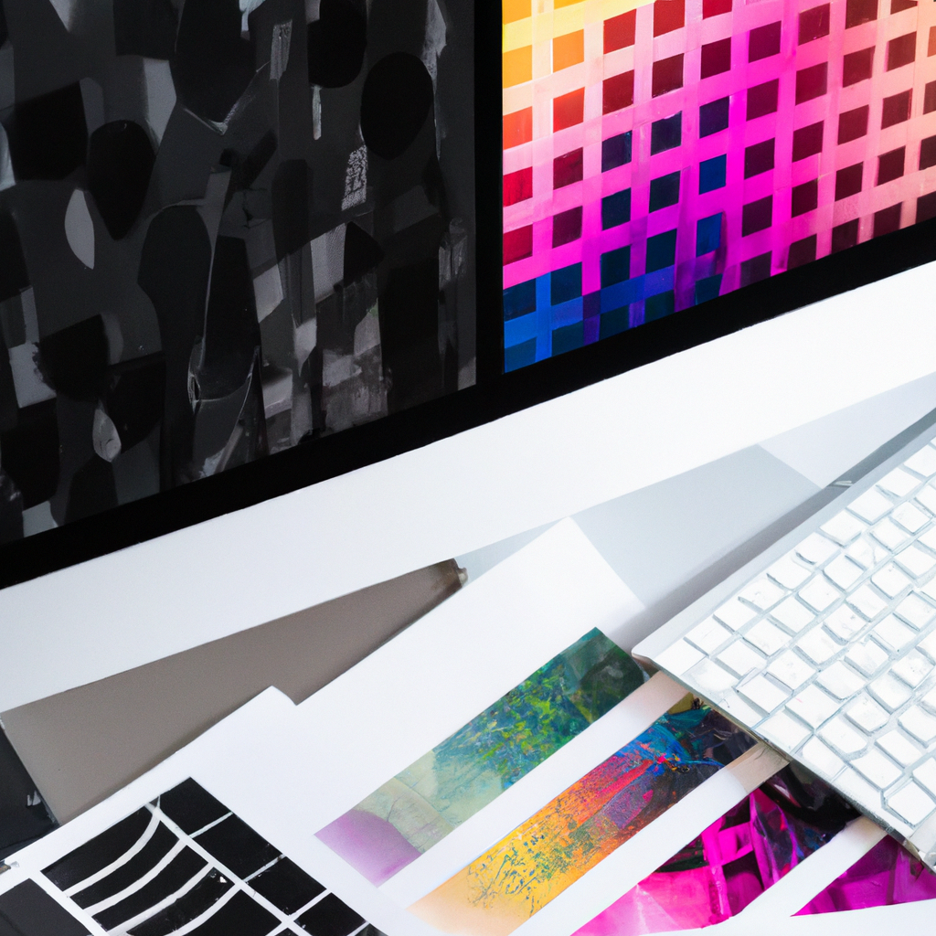
One aspect of graphic design that continually captivates me is the power of contrast. Often mistaken as merely a visual gimmick, contrast is a potent concept that, when correctly used, can dramatically enhance the impact and effectiveness of a design.
Cracking the Contrast Code: Why it Matters
Here are a few reasons why I consider contrast to be a crucial ingredient in successful design:
- Enhances Readability: Proper contrast can significantly improve the readability of your designs, ensuring your message is conveyed effectively.
- Creates Focus: The right contrast can guide the viewer’s eye to important areas or elements in your design.
- Adds Visual Interest: Contrast can prevent your designs from looking too monotonous, adding excitement and visual intrigue.
Steps to Incorporate Contrast Effectively
Getting the hang of using contrast in graphic design could take some time, but with practice, it becomes much more intuitive. Here’s how to start:
- Choose Opposite Elements: The essence of contrast lies in difference. You can create contrast by using opposite or drastically different elements together in a composition.
- Adjust Levels Sensitively: Be sensitive about the levels of contrast. Too slight, and it may go unnoticed; too high, and it could look unpleasant.
- Use it for Impact: Use contrast to drive home a message, make a statement, or highlight a key part of your design.
Contrast in Action
The principle of contrast is everywhere in design. High contrast black and white photos, vibrant UI designs, or striking poster designs–all leverage contrast to create impact and attract attention.
The Delicate Balance of Contrast
Creating effective contrast is a careful balancing act. With enough practice and understanding, you’ll be able to instinctively know how and when to dial up or down the contrast.
The Journey of Mastering Contrast
Imbued with visual power and versatile functions, contrast has claimed its rightful seat as one of the most valuable tools in my design toolbox.
Contrasting colors, sizes, shapes, and types can lead to designs that are not just visually pleasing, but also dynamic and engaging. Mastering contrast has allowed me to take my designs from ordinary to extraordinary, lending them a visual advantage.
As designers, let us challenge ourselves to break free from the monotony and be daring in our use of contrast. So, delve into the myriad possibilities of contrast, experiment creatively, and watch as your designs become more vibrant and impactful. Embrace the contrasting elements, because, in design, contrast is not just about conflict; it is about creating harmony within the chaos. Happy contrasting!