Living Lines: Guiding Direction, Crafting Forms, and Defining Boundaries in Graphic Design

Living Lines: Guiding Direction, Crafting Forms, and Defining Boundaries in Graphic Design Featured Image
Lines in graphic design guide viewer direction, shape forms, and define boundaries to enhance clarity and focus. Tips include playing with line variety and stylization, using lines for effects like depth and division, and creating purposeful designs. Examples like the Google logo highlight the central role lines play in design impact. Incorporating lines into designs amplifies creativity, making the canvas a space for innovation and visual storytelling. Happy designing!

Living Lines: Understanding the Power of Lines in Graphic Design

Line Enchantment: My Introduction to Design Lines

In my artistic voyage through the colossal seas of graphic design, I encountered a seemingly simplistic but remarkably potent tool – Lines. These silent markers of the design canvases soon became the unsaid chorus of my creative compositions.

The Linear Lexicon: Importance of Lines

Why should a humble line command such a fundamental position in graphic design? Let me demystify that:

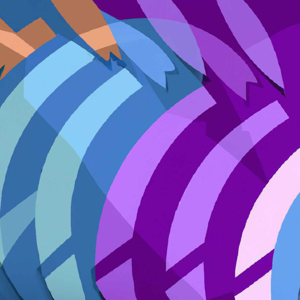
  • Direction and Movement: Lines can steer the viewer’s eye, guiding the flow and feel of the design, effectively leading viewers on a visual journey.
  • Creating Shapes and Forms: Lines, the foundation of shapes and forms, can be used to create complex design elements.
  • Defining Boundaries: Lines can distinguish separate components within a design, adding clarity and focus.

Drawing the Line: Tips for Using Lines

Working with lines can be an art in itself; a seemingly simple stroke carries great design potential. Here are some tips from my experience:

  • Variety and Stylization: Play with various line attributes—thickness, texture, continuity—for distinct impacts. Flexible or rigid, thin or thick, direct or abstract—each brings a unique flavor.
  • Lines for Effect: Apply lines to suggest depth, create shadows, divide spaces, or even create illusions.
  • Create with Purpose: Use lines intentionally. Random lines can confuse or divert the viewer. Purposeful lines enhance overall design coherence.

Linear Impact: Lines in Action

The true power of lines can be witnessed in many phenomena of design. Consider the simple yet elegant Google logo, where the line work plays a central role, or in architectural sketches, where lines convey perspective, depth, and detail.

Linear Lore: Journey with Lines

Incorporating lines into my design process significantly magnified my ability to construct compelling visuals. With lines as allies, my canvas became a playground for creativity and innovation.

To my kindred spirits in design, let lines be the guides for visual explorations. Stroke after stroke, let’s utilize the raw energy of lines to carve out compelling narratives on our canvases. Remember, it’s in lines we trust; it’s through lines we communicate. Happy designing!

Geometric Shapes in Design: Visual Interest, Creating Meaning, Organized Layout Featured Image

Geometric Shapes in Design: Visual Interest, Creating Meaning, Organized Layout

Geometric shapes in design create visual interest, convey meaning, and aid in organizing layouts. Understanding psychological effects, maintaining balance, and using shapes as containers are key tips for leveraging geometric shapes effectively in designs. Examples like the Twitter and Microsoft logos demonstrate the power of geometric shapes in creating meaningful and visually appealing designs. Happy designing!

Read More »
Customizing Privacy Settings: Safeguarding Your Digital Presence Featured Image

Customizing Privacy Settings: Safeguarding Your Digital Presence

Customizing privacy settings is vital in the digital landscape for data protection and controlled sharing. Social media and web browsers offer options for profile visibility, tagging control, and managing cookies. Device privacy settings govern location services and app permissions. Regularly reviewing and updating settings ensures a safe online experience.

Read More »
Symmetry in Design: Aesthetical Appeal, Easy Processing, Professionalism Featured Image

Symmetry in Design: Aesthetical Appeal, Easy Processing, Professionalism

Symmetry in design creates aesthetical appeal, enhances professionalism, and is easy on the eye. Achieving balance through alignment, mixing symmetric and asymmetric elements, and paying attention to negative space are essential for symmetrical designs. Examples like the ‘McDonald’s’ and ‘Mercedes Benz’ logos showcase the power of symmetry in creating visually pleasing compositions. Happy designing!

Read More »
Design Consistency: Professionalism, Recognition, Trust and Familiarity Featured Image

Design Consistency: Professionalism, Recognition, Trust and Familiarity

Design consistency in graphic design exudes professionalism, aids in brand recognition, and builds trust with viewers. Establishing guidelines, maintaining uniformity in size and placement, and utilizing repetition are key strategies for achieving design consistency. Examples like ‘McDonald’s’ and ‘Turban Kabab House’ logos showcase the impact of consistency in successful branding. Happy designing!

Read More »
Typography in Graphic Design: Communication, Personality, User Experience Featured Image

Typography in Graphic Design: Communication, Personality, User Experience

Typography in graphic design is crucial for communication, conveying personality, and enhancing user experience. Selecting fonts wisely, establishing hierarchy, and paying attention to spacing are key tips for effective typography. Examples like ‘Netflix’ and ‘Coca-Cola’ demonstrate the impact of typography in creating visually appealing and engaging designs. Happy designing!

Read More »