Power of Proportions: Enhancing Cohesion, Informed Placements, and Readability with Grid Systems

Power of Proportions: Enhancing Cohesion, Informed Placements, and Readability with Grid Systems Featured Image
Grid systems provide structural cohesion, informed placements, and enhanced readability in graphic design. Tips include choosing the appropriate grid type, maintaining consistency, and breaking free when necessary for emphasis. Examples like Swiss design posters and website layouts showcase the effectiveness of grid systems in establishing harmony. Incorporating grid systems brings reliable structure to design elements. Designers should embrace the controlled beauty of grid systems for foundational support in creating structured and visually appealing designs. Happy designing!

Power of Proportions: Grasping Grid Systems in Graphic Design

The Grid Guide: My Insights into Organized Design

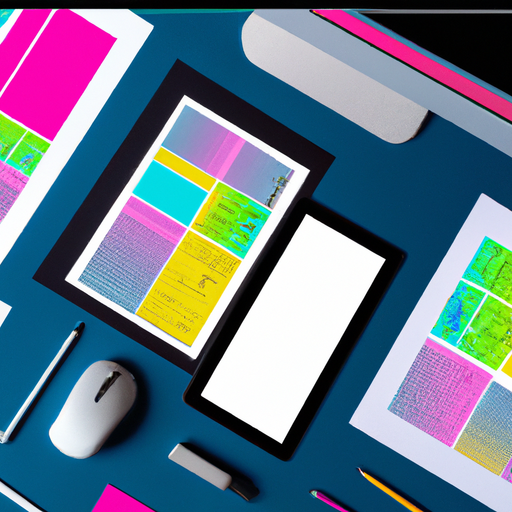
During my expedition in the dynamic landscape of graphic design, I stumbled upon an architectural marvel – Grid Systems. This structural framework brought a new level of order and harmony to my creative canvas.

Grid Goals: Why are Grid Systems Important?

Why dedicate a tip to grid systems, in a field bubbling with innovative techniques and tools? Here’s my perspective:

  • Structural Cohesion: Grid systems provide a structural base, enhancing the overall cohesion and balance of your design.
  • Informed Placements: Defined grids ensure the strategic and informed placement of design elements.
  • Enhanced Readability: Grids aid in creating clean layouts that promote easier navigation and readability.

Getting in Line: Tips for Working with Grids

Mastering the art of grids demands a studied approach. Here are some insights I’ve gained:

  • Choose Appropriately: Grid type should depend on your design needs. For instance, a column grid for a magazine layout, modular grid for web design, etc.
  • Consistency is Key: Maintain consistency in using the grid across different parts of your design to avoid visual cacophony.
  • Break Free When Needed: Grids are guides, not chains. Feel free to break from the grid to emphasize certain elements.

Grid Glory

Grid systems’ effectiveness shines in several renowned designs – the modernist Swiss design posters, Classic website layouts, or even the Instagram app interface. Grids establish an unsung harmony in these designs.

Aligning Vectrors: My Grid Growth

Bringing grid systems into my design world was a profound game-changer. They gave me a reliable backbone to arrange my design elements attractively and methodically.

My message to fellow designers – Let’s not shy away from the controlled beauty of grid systems. They are the reliable guides in our journey, providing foundational support that anchors our creativity. So adapt, align, and design with grids to create designs that not only please eyes but also structure perception. Happy designing!

Geometric Shapes in Design: Visual Interest, Creating Meaning, Organized Layout Featured Image

Geometric Shapes in Design: Visual Interest, Creating Meaning, Organized Layout

Geometric shapes in design create visual interest, convey meaning, and aid in organizing layouts. Understanding psychological effects, maintaining balance, and using shapes as containers are key tips for leveraging geometric shapes effectively in designs. Examples like the Twitter and Microsoft logos demonstrate the power of geometric shapes in creating meaningful and visually appealing designs. Happy designing!

Read More »
Customizing Privacy Settings: Safeguarding Your Digital Presence Featured Image

Customizing Privacy Settings: Safeguarding Your Digital Presence

Customizing privacy settings is vital in the digital landscape for data protection and controlled sharing. Social media and web browsers offer options for profile visibility, tagging control, and managing cookies. Device privacy settings govern location services and app permissions. Regularly reviewing and updating settings ensures a safe online experience.

Read More »
Symmetry in Design: Aesthetical Appeal, Easy Processing, Professionalism Featured Image

Symmetry in Design: Aesthetical Appeal, Easy Processing, Professionalism

Symmetry in design creates aesthetical appeal, enhances professionalism, and is easy on the eye. Achieving balance through alignment, mixing symmetric and asymmetric elements, and paying attention to negative space are essential for symmetrical designs. Examples like the ‘McDonald’s’ and ‘Mercedes Benz’ logos showcase the power of symmetry in creating visually pleasing compositions. Happy designing!

Read More »
Design Consistency: Professionalism, Recognition, Trust and Familiarity Featured Image

Design Consistency: Professionalism, Recognition, Trust and Familiarity

Design consistency in graphic design exudes professionalism, aids in brand recognition, and builds trust with viewers. Establishing guidelines, maintaining uniformity in size and placement, and utilizing repetition are key strategies for achieving design consistency. Examples like ‘McDonald’s’ and ‘Turban Kabab House’ logos showcase the impact of consistency in successful branding. Happy designing!

Read More »
Typography in Graphic Design: Communication, Personality, User Experience Featured Image

Typography in Graphic Design: Communication, Personality, User Experience

Typography in graphic design is crucial for communication, conveying personality, and enhancing user experience. Selecting fonts wisely, establishing hierarchy, and paying attention to spacing are key tips for effective typography. Examples like ‘Netflix’ and ‘Coca-Cola’ demonstrate the impact of typography in creating visually appealing and engaging designs. Happy designing!

Read More »