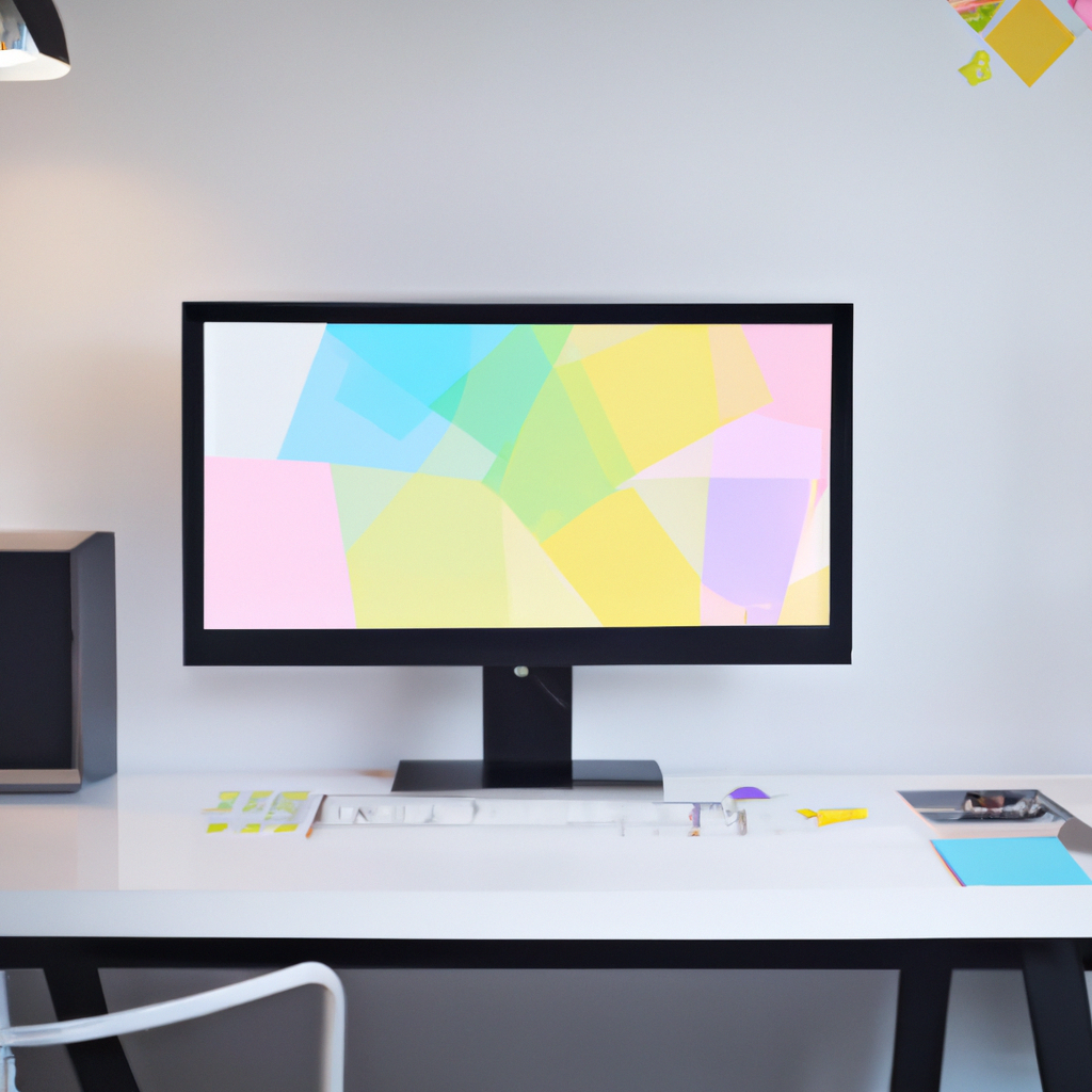
The Art of White Space: The Power of Nothing in Graphic Design
My Encounters with White Space
When I first began my path as a graphic designer, I had a flawed assumption that every inch of the design must be filled. But my comprehension of design was flipped on its head when I discovered the profound potency of white space. Also known as Negative Space, this design fundamental, contrary to its name, has added a positive impact to my work.
White Space and Design: The Unseen Hero
Why is white space so influential in design? Let me share my viewpoint:
- Amps Readability: Well-allocated white space can make a design easier and more comforting to read by preventing visual overload.
- Directs Focus: White space can be used to guide the viewer’s eye and highlight crucial elements in the design.
- Evokes Elegance: Adequate white space can add a sense of elegance, cleanliness, and modernity to the design.
Navigating Nothingness: How to Use White Space
How can you effectively employ white space in your designs? Here’s my advice:
- Be Intentional: Plan the usage of white space as meticulously as you would with any other design element.
- Breathe Easy: Leave breathing room around text and images, enhancing readability and aesthetic appeal.
- Frame Your Focus: Use white space to spotlight your focal points. Let the emptiness scream for attention.
White Space Work Wonders
Glance at successful designs or even brand logos and you’ll notice how cleverly white space is used. Apple, Google, or even luxury fashion brands like Chanel masterfully utilize white space to simplify complex information and create visually appealing designs.
Affairs with Space: Embracing Nothingness
Incorporating white space is no longer foreign but integral to my design philosophy. It’s taught me that ‘doing nothing’ has its place and power in graphic design. In the book of design, white space has been my most potent chapter, adding silence to the design symphony.
So dear designers, let’s celebrate the unoccupied and overshadowed hero of our designs – the white space. Let’s remember that in the world of design, white space isn’t a mere vacancy. It’s the vacuum that breathes life and clarity into our creations. Let’s harness nothing to say something. Happy designing!