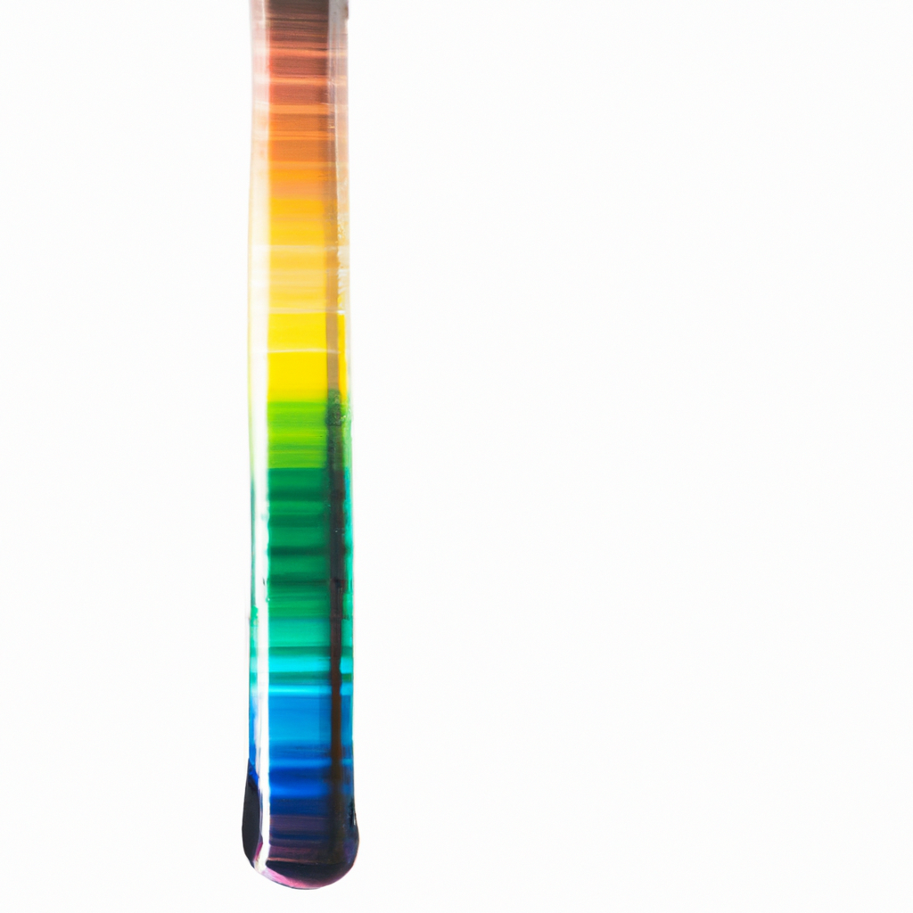
Deciphering the Language of Color in Graphic Design
Often taken for granted, color is a powerful tool that can dramatically impact design outcomes. By the end of this discourse, I hope you will gain a new appreciation for how color choices can significantly influence consumers, design users and the overall message conveyed in designs.
Color: The Unspoken Communicator
Imagine color as an unspoken language. On its own, it has the power to evoke emotions, communicate meanings, and even influence decisions. Color in design is more than just a decorative element. It communicates silently, setting the mood, driving perceptions and influencing emotions. Clearly, color wields a virtual wand, dictating the mood and reactions to a design piece while subtly advancing the intended message.
Why Color Matters in Design
While color may appear trivial, its role in the world of design is paramount. Here’s why you should take a closer look at the colors you use:
- Cues Emotion: Colors have the power to evoke emotional responses. They can incite excitement, induce calm, or even stir up a sense of urgency.
- Aides Recognition: A solid color palette can make brands instantly recognizable. Think about the iconic Tiffany’s blue or the easily identifiable Facebook blue.
- Directs Perception: Color can affect how we perceive and interpret visual information. For instance, dark hues can seem heavy while lighter ones appear lightweight.
Color Theory: The Basis of Understanding Color
While color selection might seem largely subjective, there exists an underlying order – color theory. Color theory lays out the fundamental guidance on how colors interact, their harmony, and their psychological effects. Understanding color theory equips designers with a manual to predict how colors will interact and the feelings they are likely to invoke in viewers.
Color Wheel: The Foundation of Color Theory
The color wheel, with its origin dating back to Sir Isaac Newton’s work in 1666, forms the basis of color theory. It is a visual representation of colors arranged according to their chromatic relationship. At the most basic level, primary colors (red, yellow, blue), secondary colors (colors resulting from the mixture of primary colors), and intermediate or tertiary colors (produced by combining primary and secondary colors) are represented on the wheel. Gaining an in-depth understanding of these relationships can aid you in making more informed color choices in your designs.
Color Harmony: Creating Balance and Unity
Color harmony refers to the formulation of aesthetically pleasing color combinations. Much like music, colors need to be harmonious to create desirable compositions. Understanding color harmony principles can help you create visually appealing designs. This includes concepts like complementary colors, analogous colors, triadic colors, and tetradic colors.
Color Psychology: The Emotional Palette
Every hue in a designer’s palette has an associated psychological value. These connections between color and emotion are incredibly potent in design as they play a pivotal role in brand perception and user interaction. Here’s a look at the emotional cues of some common colors:
- Red: Passion, urgency, and excitement
- Blue: Trust, calm, and reliability
- Yellow: Happiness, youthfulness, and optimism
- Green: Growth, fertility, and health
- Black: Power, sophistication, and mystery
- White: Cleanliness, simplicity, and purity
- Purple: Royalty, wealth, and success
Color and Branding: Beyond Aesthetics
In branding, color plays a crucial role beyond aesthetics. The colors chosen for a brand can profoundly affect how that brand is perceived and experienced. Every color choice in branding has an impact on design performance, affecting readability, usability, and the psychological impact of the brand on its customers.
The Power of Contrast in Design
Rounding off this colorful exploration, we must visit contrast – a design principle that is directly influenced by color choices. Proper contrast does not merely aid visual accessibility; it increases interest and legibility, enhancing design impact and effectiveness. Utilising a considerate contrast within a design piece can emphasise or diminish specific elements, aiding in the overall visual hierarchy.
Mastering color in design is both an art and a science. Imbued with the power to evoke emotion, establish associations, and command attention, color is undoubtedly a formidable tool in the hand of a graphic designer. So, are you ready to paint your design journey with a deeper understanding of color?