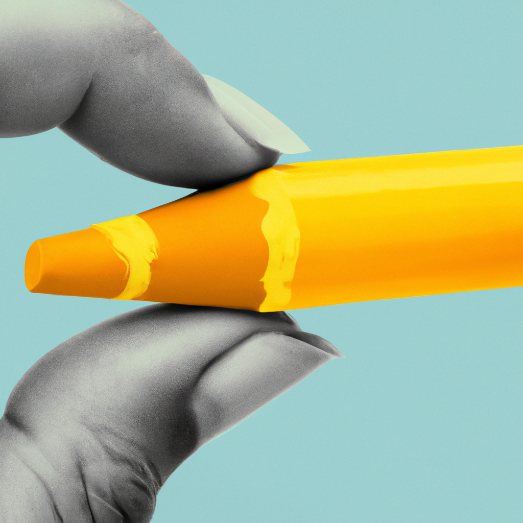
Unleashing the Power of Color Psychology in Graphic Design
Think of an appealing website you recently visited, a catchy billboard you spotted, or a gripping book cover that piqued your curiosity. What do they.have in common? A strategic use of colors, which play a pivotal role in evoking specific reactions and effectively conveying messages. So, allow me to guide you through the engaging world of color psychology in graphic design.
Deciphering Color Psychology in Design
For the uninitiated, color psychology is the study of hues as a determinant of human behavior. It’s not only about making your designs look pretty; it’s about stirring emotions and sparking actions with colors. Different colors evoke distinct emotional responses, and understanding these nuances is a potent tool for designers.
Colors: The Emotion-triggering Element of Design
The influence of colors on a design’s effectiveness is often underestimated, but it’s colossal. The right color scheme can set your design’s tone, emphasize crucial elements, and resonate emotionally with viewers. Thus, mastering the art of color psychology isn’t merely a design consideration; it’s a key to effective visual communication.
Getting Started with Color Psychology
While color psychology may seem intimidating, fear not. Here’s a succinct guide to acquaint you with the fascinating world of color psychology:
- Understand the emotions associated with basic colors.
- Experiment with different color schemes in your designs and observe their effect.
- Delve into color psychology theories and studies to broaden your understanding.
- Consider the cultural interpretations of colors while designing for a global audience.
Besides, numerous online courses can provide a comprehensive understanding of color psychology.
Colors: The Unsung Heroes in Effective Design
Colors, much like typography or imagery, subtly yet significantly enhance your design. They guide the viewer’s gaze, emphasize key information, and help visually structure your design. Even though their importance often goes unnoticed, the absence of meticulously selected colors can drastically affect the success of a design.
Colors: Breathing Life into Designs
No matter your niche in graphic design, understanding and using color psychology can considerably elevate your work. From defining the mood of a website to crafting an impactful logo, judicious use of colors can work wonders. So, are you ready to let colors breathe life into your designs?
Colors: The Pens Painting Emotional Stories
Adept use of colors doesn’t just add visual appeal to your designs, but it also enables your designs to tell compelling stories. The right colors make your designs emotionally resonant, guiding the viewer through the design and enhancing the overall aesthetic appeal. The mastery of color psychology not only makes your designs visually appealing but also paves the way for successful visual storytelling.
Colors in Graphic Design: Key Outcomes
Here’s a snapshot of what you can accomplish by thoughtfully integrating color psychology into your designs:
- Create a mood for your design and inspire desired emotional responses.
- Highlight vital information and guide the viewer’s visual journey through the design.
- Define your brand identity and increase brand recognition.
- Improve aesthetics and make your design more visually appealing.
In the fascinating realm of graphic design, understanding the art of color psychology can significantly bolster your visual communication skills. Delve into the vivid world of colors and let your designs resonate emotionally with your audience. Always remember, successful design lies in the details!