Typography Matters: The Art of Choosing the Right Font
My Story with Typography
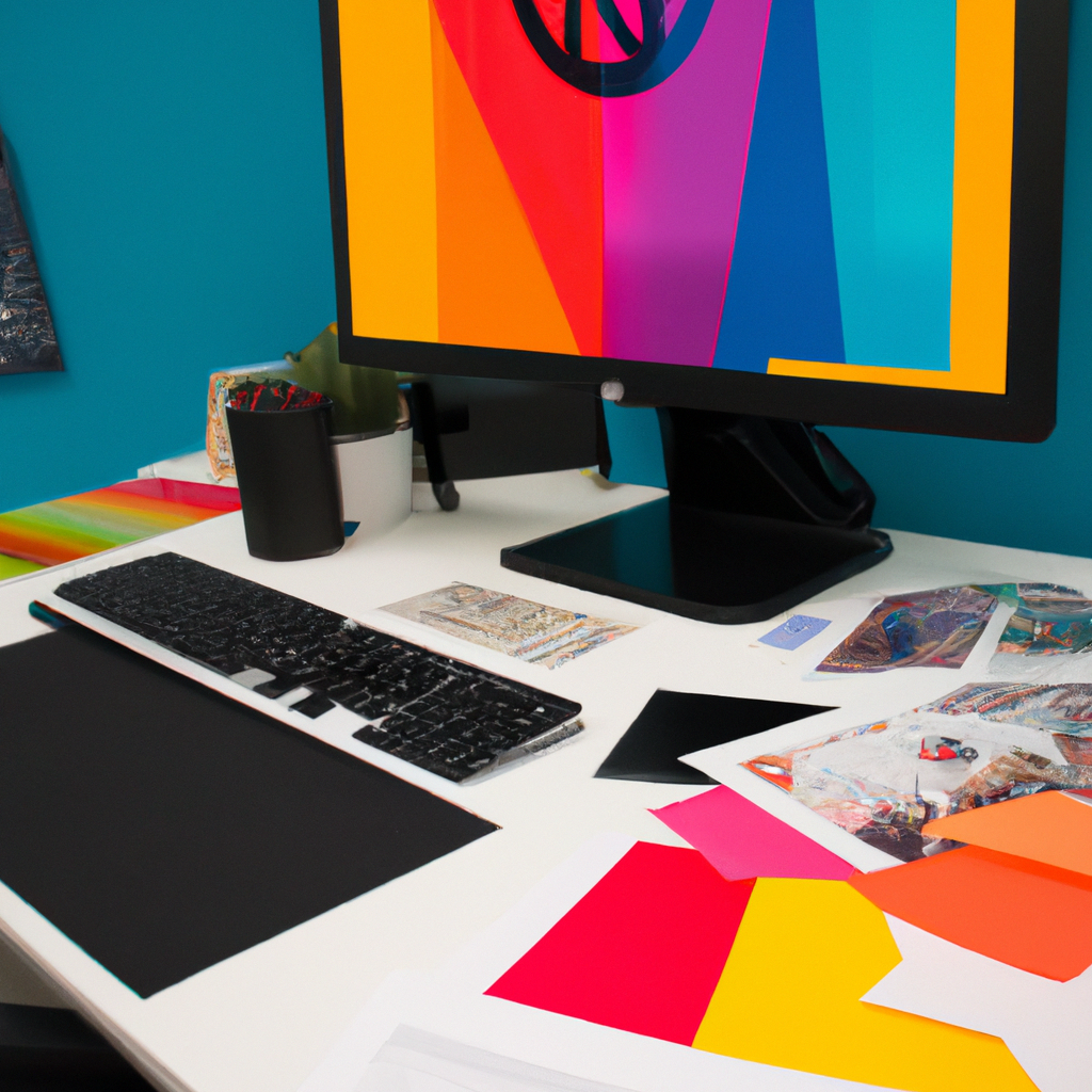
In my design journey, I quickly realized that typography is not a mere afterthought. The fonts represent an integral part of any visual communication – they speak even when the letters are silent, enhancing the overall design and its impact.
The Impact of Typography in Design
Why is typography so crucial in graphic design? Here’s my take:
- Enhances Readability: The right font can significantly improve the legibility of your content, enhancing user experience.
- Macros and Evokes Emotions: Fonts have personalities. They can provoke specific emotions and associate with specific genres or themes.
- Strengthens Brand Identity: Consistency in typography can reinforce brand recognition, strengthening your visual identity.
Tips to Master Typography
How do you choose the right font? How do you use it effectively? Here are some tips from my own experience:
- Know Your Message and Audience: Choose a font that resonates with the message you convey and your target audience. A corporate report might require a professional-looking serif font, while a children’s book might be better with a fun and engaging sans-serif.
- Contrast is Key: Use contrasting fonts to create a clear visual hierarchy and to emphasize specific points.
- Less is More: Overloading your design with multiple fonts can create visual chaos. Stick to a maximum of two or three that work well together.
Typography in the Real World
Successful brands have effectively implemented typography in their logo designs, marketing campaigns, and overall branding. Look at iconic brands like Coca-Cola, Apple, or Vogue and notice how their distinctive typography contributes to their brand identity.
Embracing Typography: From ABC to Art
Embracing typography and its nuances has enriched my designs and their communication power. I’ve learned that typography is not just about making words legible; it’s about making them speak, resonate and stand out.
So, let’s dive into the world of letters and fonts, where the choice of typography can sometimes say more than the words themselves. Remember, in the world of graphic design, typography dresses your words, it’s your text’s design. Let’s choose that dress wisely. Happy designing!