Chocolate And White App Icons Aesthetic App Covers iOS 17 Home Screen Social Media Icons With iPhone Wallpaper by ErynRochelleDesigns
https://ift.tt/tmYHOae 9.50 USD Beautifully designed icons to help you customize your device and express your personal style! This listing is for a digital product. You will NOT be shipped a physical product. Upon purchase, you will receive a downloadable folder that contains your digital files. Your purchase includes the following items: ★ 70+ App Icons […]
Color Psychology in Graphic Design: Eliciting Emotions, Influencing Decisions, and Elevating Brand Identity
Color psychology plays a crucial role in graphic design, invoking emotions, influencing decisions, and elevating brand identity. Understanding the audience, conveying the right emotion through color choices, and maintaining consistency are key in incorporating color psychology into designs. Observing designs around us reveals the strategic use of colors to capture attention and highlight information. Embracing color psychology enhances design impact and improves communication with viewers. Let designs speak the language of colors and make a memorable impression on the world.
The Healing Power of Hierarchies: Making Designs Digestible, Guiding Viewers, and Boosting Effectiveness
Hierarchies, with their ability to make designs digestible, guide viewers, and boost effectiveness, are powerful tools in graphic design. Establishing hierarchy can be achieved by identifying key points, utilizing typography and color, and maintaining visual balance. Hierarchies are present in well-designed billboards, app interfaces, and magazine layouts. Embracing hierarchies brings order, clarity, and amplified communication to designs. Explore and experiment with hierarchies to let designs speak volumes.
Negotiating Is A Super Power Union Shirt, Collective Bargaining, Union Activist Shirt, Union Dad Gift, Union Strike Shirt, Union Strong by SolidarityShoppe
https://ift.tt/5K07MpE 24.19 USD This classic unisex jersey short sleeve tee fits like a well-loved favorite. Soft cotton and quality print make users fall in love with it over and over again. These t-shirts have-ribbed knit collars to bolster shaping. The shoulders have taping for better fit over time. Dual side seams hold the garment's shape […]
Union People Organizing With Effective Results Short-Sleeve Unisex T-Shirt #0001A by SolidarityShoppe
https://ift.tt/hNFWAiE 27.94 USD In a world where solidarity among workers is more crucial than ever, this high-quality unity t-shirt is the perfect avenue to display your support for the labor movement. This exceptional shirt crafted with top-notch materials exemplifies style and emphasizes the significance of unity among workers. No longer should your wardrobe be limited […]
Trump Mugshot Shirt, Trump Legend Shirt, POTUS Mug Shot Tshirt, Save America Tshirt, Trump 2024 Tee, Funny Trump MAGA Gift by SolidarityShoppe
https://ift.tt/6tQ81aJ 24.19 USD This classic unisex jersey short sleeve tee fits like a well-loved favorite. Soft cotton and quality print make users fall in love with it over and over again. These t-shirts have-ribbed knit collars to bolster shaping. The shoulders have taping for better fit over time. Dual side seams hold the garment's shape […]
Grappling with Grids: Achieving Cohesion, Consistency, and Improved Readability in Graphic Design
Grids serve as the backbone of graphic design, offering cohesion, facilitating consistency, and improving readability. By selecting a suitable grid layout, sticking to it, and creatively bending but not breaking the grid, designs can be simplified and made more professional-looking. Grid-based layouts are commonly observed in newspapers, websites, and posters. Mastering grids allows for speedier design processes and improved designs that achieve balance and harmony. Embrace the grid-filled world, align designs with objectives, and let the grid support creativity.
Unleashing iOS Device Potential: Advanced Customization for Power Users
Unlock advanced customization options on your iPhone or iPad by accessing power user settings on iOS devices. Developer settings offer control over networking and GPU statistics. Utilize shortcuts to simplify complex commands and automate tasks. Enhance device performance with background app refresh and app offloading. Fine-tune privacy settings with granular control over location services and analytics sharing. Explore these power user settings to personalize, boost efficiency, and maximize your iOS device’s capabilities.
The Golden Rule of Graphic Design: Enhancing Balance, Appeal, and Attention with the Golden Ratio
The Golden Ratio, with its aesthetic balance and enhanced appeal, is a valuable principle in graphic design. By using it in layout design, individual elements, and utilizing Golden Ratio tools, designs can achieve an appealing proportion and guide the viewer’s attention. The Golden Ratio can be observed in architecture and nature. Incorporating the Golden Ratio enhances the aesthetic appeal and effectiveness of designs, making them resonate with audiences. Embrace the Golden Ratio and unlock design’s full potential.
Embracing Simplicity in Graphic Design: Enhancing Comprehension, Maintaining Focus, and Boosting Recall

Simplicity is a powerful principle in graphic design that enhances comprehension, maintains focus, and boosts recall. To embrace simplicity, keep designs minimal, prioritize function over form, and utilize white space. Iconic designs like Nike, Apple, and Google exemplify the revolution of simplicity. Embracing simplicity elevates design skills and allows for effective communication and inspiration.
Proportion and Balance in Graphic Design: Establishing Visual Harmony, Guiding Viewer’s Gaze, and Making Designs Effective
Proportion and balance are essential in graphic design as they establish visual harmony, guide the viewer’s gaze, and make designs more effective. Prioritizing elements, achieving symmetry or asymmetry, and practicing are key to leveraging proportion and balance effectively. Observing designs around us can inform our own design decisions. Proportion and balance add aesthetic value, impact, and effectiveness to designs, making them compelling and engaging.
Customizing for Accessibility: Inclusive Tech for All
Customization for accessibility in technology ensures that everyone, including individuals with disabilities and older people, can effectively use devices, services, and applications. It promotes inclusion, complies with legal requirements, and expands user bases for businesses. Examples of accessibility customization include smartphone settings, web design guidelines, and digital assistants. As technology advances, there will be more opportunities for AI integration and advanced assistive technologies in accessibility customization.
The Art of Alignment in Graphic Design: Providing Structure, Aiding Readability, and Boosting Aesthetics
Alignment plays a crucial role in graphic design by providing structure, aiding readability, and boosting aesthetics. Effective alignment can be achieved by using grids, aligning text properly, and avoiding arbitrary element placement. Observing alignment in action in various designs showcases its importance. Mastering alignment can significantly improve the quality and professionalism of designs. Every detail counts in graphic design, and alignment is a detail that stands out.
2024 Wallpaper
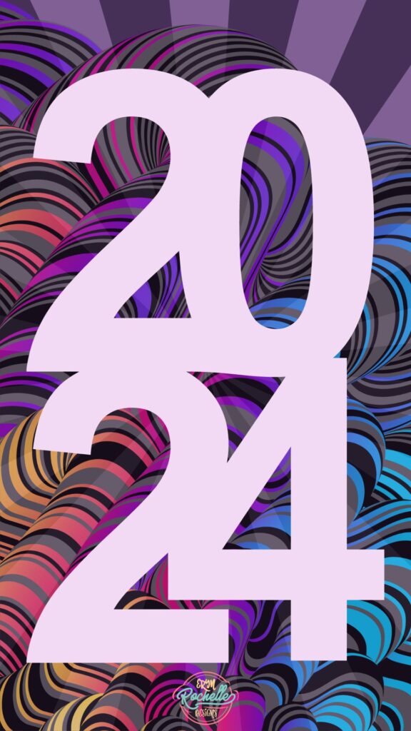
Welcoming the year 2024, this captivating graphic design exudes a celebration of time’s relentless march forward. The centerpiece, ‘2024,’ stands out in pastel pink against an intricate maze of psychedelic swirls, embodying the year’s promise of innovation and dynamism. The background’s pulsating patterns, with their deep purples, electric blues, and spirited accents, evoke a sense of futuristic rhythm and boundless potential. This piece is not just a visual feast; it’s a symbolic herald of the excitement and opportunities that the new year holds. ‘Vibrant Elegance: Welcoming 2024’ thus becomes a beacon of hope and a testament to the artistry that awaits us.
Gaining Command Over Contrast in Graphic Design: Enhancing Readability, Creating Focus, and Adding Visual Interest
Contrast is a powerful concept in graphic design that enhances readability, creates focus, and adds visual interest. To incorporate contrast effectively, choose opposite elements, adjust contrast levels sensitively, and use it for impact. Contrast can be observed in various design applications, and mastering it can elevate designs from ordinary to extraordinary. Embrace contrast to create vibrant and impactful designs that harmonize contrasting elements.
Pink And White App Icons Aesthetic App Covers iOS 17 Home Screen Social Media Icons With iPhone Wallpaper by ErynRochelleDesigns
https://ift.tt/M45yiCH 9.50 USD Beautifully designed icons to help you customize your device and express your personal style! This listing is for a digital product. You will NOT be shipped a physical product. Upon purchase, you will receive a downloadable folder that contains your digital files. Your purchase includes the following items: ★ 70+ App Icons […]
Union Queen Short-Sleeve Unisex T-Shirt #0001A by SolidarityShoppe
https://ift.tt/rn7jODu 25.45 USD In a world where solidarity among workers is more crucial than ever, this high-quality unity t-shirt is the perfect avenue to display your support for the labor movement. This exceptional shirt crafted with top-notch materials exemplifies style and emphasizes the significance of unity among workers. No longer should your wardrobe be limited […]
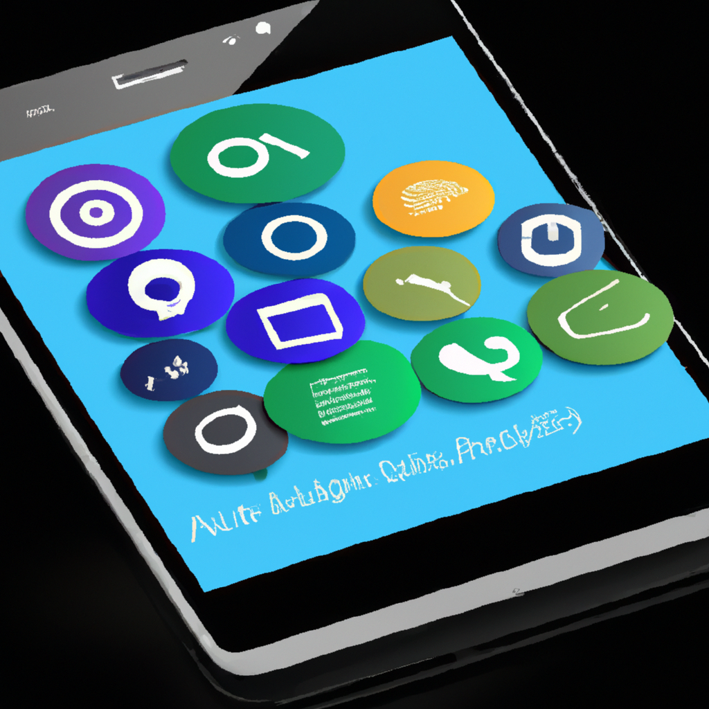
Revolution of Smartphone Screen Customization: Wallpaper to Live Themes
Smartphone screen customization has evolved from static wallpapers to dynamic live themes. Early customization options included custom and preloaded wallpapers. Live wallpapers introduced interactivity and dynamic content. Today, live themes offer deep customization, including changes to icons, menu layouts, and animations. The future may bring immersive AR and VR experiences and AI-powered customization. Personalized digital experiences will continue to evolve with technology.
The Reign of Repetition in Graphic Design: Establishing Consistency, Enhancing Memorability, and Guiding Flow
Repetition is a powerful design element that establishes consistency, enhances memorability, and guides flow. To use repetition effectively, be thoughtful about what to repeat, be consistent in its usage, and avoid overkill. Repetition can be observed in popular brand designs, and it is a tool, not a rule, that adds impact to designs. Utilizing repetition creates rhythm, familiarity, and resonance, resulting in memorable and effective designs.
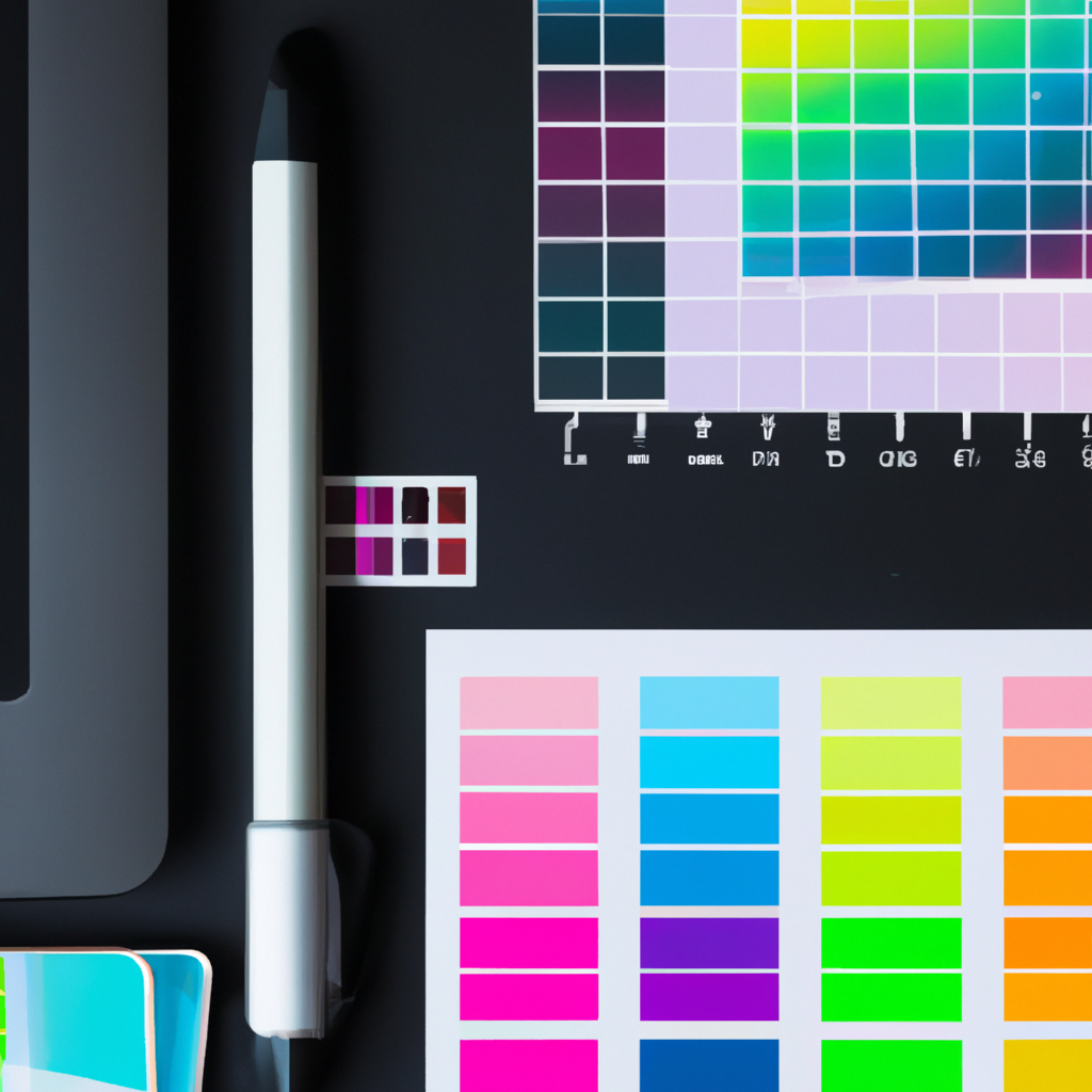
Mastering Color Theory in Graphic Design: Creating Mood, Shaping Perceptions, and Enhancing Visibility
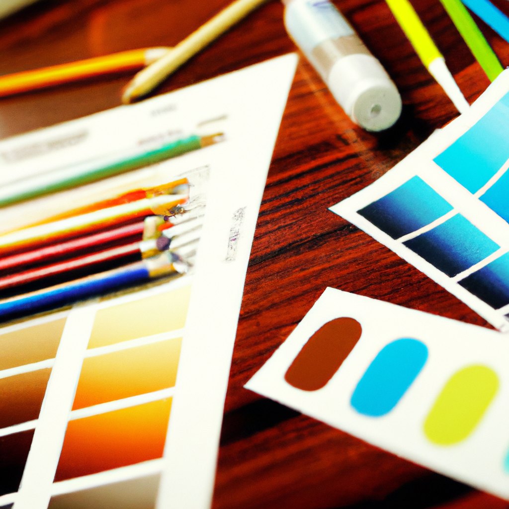
Color theory is a vital aspect of graphic design, as it creates mood, shapes perceptions, and enhances visibility. Understanding the color wheel, learning about color schemes, and considering cultural inputs are foundational principles in color theory. Observing real-world applications and continuous learning can greatly improve design skills. Using color thoughtfully can communicate and engage audiences effectively, making it a powerful tool in design.