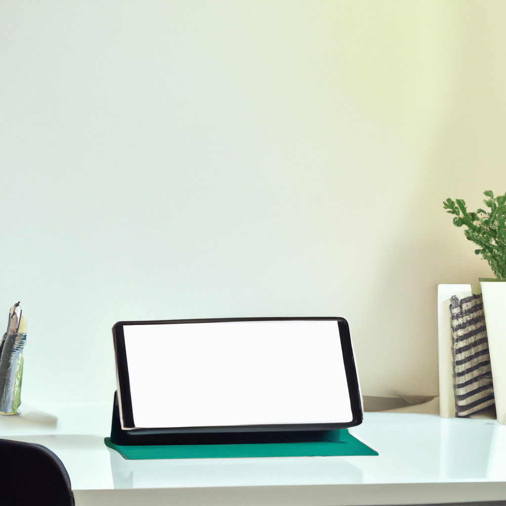
Breaking the Ice with White Space: Boosting Legibility, Creating Focus, and Simplifying Design in Graphic Design

Breaking the Ice with White Space: Boosting Legibility, Creating Focus, and Simplifying Design in Graphic Design Featured Image
White space in graphic design boosts legibility, creates focus, and simplifies the overall visual experience. Tips for mastering white space include striking a balance between empty space and design elements, applying consistent white space, and utilizing both micro and macro white space. Examples like Apple's website showcase the potency of white space. Embracing white space brings simplicity, grace, and precision to designs. Let's utilize the power of white space to communicate clarity and create impactful designs. Happy designing!

Breaking the Ice with White Space: Maximizing Minimalism in Graphic Design

Unearthing the Unseen: My Encounter with White Space

As a graphic designer, I always thrived on the beauty of colors, shapes, and textures until I met the unsung hero of design: white space. This invisible yet influential performer became a powerful ally in my design journey.

Blank Canvas, Bold Statement: The Power of White Space

You may ask, what’s special about empty space? Let’s take a closer look:

  • Boosts Legibility: Strategic use of white space makes your design easier to navigate, promoting readability.
  • Creates Focus: White space helps isolate and emphasize key design elements, guiding the viewer’s attention.
  • Simplifies Design: Clean, uncluttered design with ample white space enhances the overall visual experience.

Framing the Void: Tips to Master White Space

Applying white space is more than just leaving parts of your design empty. Here are my pearls of wisdom:

  • Balancing Act: Work towards striking an optimal balance between empty space and design elements.
  • Consistency Counts: Consistently apply white space, creating a natural rhythm in your design.
  • Space Diversification: Use both micro (between elements) and macro (large areas) white space effectively.

Embracing Emptiness: White Space at Work

We witness the wonders of white space every day. The clean look of Apple’s website or the undisturbed elegance of high-fashion magazine layouts showcase its potency.

Filling the Void: My White Space Wisdom

Once I recognized the potency of white space, it dramatically transformed my design mentality. It brought simplicity, grace, and precision to my designs, creating visual melodies harmonized by silence.

To my fellow designers, I say, let’s become conversant with this language of absence. Allow white space to whisper simplicity, shout focus, and communicate clarity through your designs. Together, let’s unmask the hidden power in the absence of noise. Happy designing!

Geometric Shapes in Design: Visual Interest, Creating Meaning, Organized Layout Featured Image

Geometric Shapes in Design: Visual Interest, Creating Meaning, Organized Layout

Geometric shapes in design create visual interest, convey meaning, and aid in organizing layouts. Understanding psychological effects, maintaining balance, and using shapes as containers are key tips for leveraging geometric shapes effectively in designs. Examples like the Twitter and Microsoft logos demonstrate the power of geometric shapes in creating meaningful and visually appealing designs. Happy designing!

Read More »
Customizing Privacy Settings: Safeguarding Your Digital Presence Featured Image

Customizing Privacy Settings: Safeguarding Your Digital Presence

Customizing privacy settings is vital in the digital landscape for data protection and controlled sharing. Social media and web browsers offer options for profile visibility, tagging control, and managing cookies. Device privacy settings govern location services and app permissions. Regularly reviewing and updating settings ensures a safe online experience.

Read More »
Symmetry in Design: Aesthetical Appeal, Easy Processing, Professionalism Featured Image

Symmetry in Design: Aesthetical Appeal, Easy Processing, Professionalism

Symmetry in design creates aesthetical appeal, enhances professionalism, and is easy on the eye. Achieving balance through alignment, mixing symmetric and asymmetric elements, and paying attention to negative space are essential for symmetrical designs. Examples like the ‘McDonald’s’ and ‘Mercedes Benz’ logos showcase the power of symmetry in creating visually pleasing compositions. Happy designing!

Read More »
Design Consistency: Professionalism, Recognition, Trust and Familiarity Featured Image

Design Consistency: Professionalism, Recognition, Trust and Familiarity

Design consistency in graphic design exudes professionalism, aids in brand recognition, and builds trust with viewers. Establishing guidelines, maintaining uniformity in size and placement, and utilizing repetition are key strategies for achieving design consistency. Examples like ‘McDonald’s’ and ‘Turban Kabab House’ logos showcase the impact of consistency in successful branding. Happy designing!

Read More »
Typography in Graphic Design: Communication, Personality, User Experience Featured Image

Typography in Graphic Design: Communication, Personality, User Experience

Typography in graphic design is crucial for communication, conveying personality, and enhancing user experience. Selecting fonts wisely, establishing hierarchy, and paying attention to spacing are key tips for effective typography. Examples like ‘Netflix’ and ‘Coca-Cola’ demonstrate the impact of typography in creating visually appealing and engaging designs. Happy designing!

Read More »