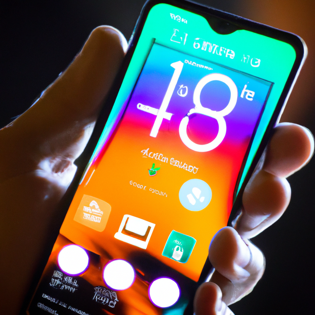
Customize and Conserve: Balancing Personalization and Battery Performance for Portable Devices

Customize and Conserve: Balancing Personalization and Battery Performance for Portable Devices Featured Image
Customizing portable devices provides personalization but can impact battery life. Features like live wallpapers and constantly updating widgets consume more power. Balancing personalization and power conservation can be achieved by limiting widget usage, using dark themes for OLED or AMOLED screens, and adjusting app sync settings. Monitor battery usage with built-in tools or third-party apps. Create a unique and efficient user experience on your device.

Customize and Conserve: Balancing Personalization and Battery Performance on Portable Devices

In an era dominated by portable devices, personalization and battery longevity are arguably two of the most crucial considerations for users. While customization grants devices a personal touch, it can sometimes lead to higher energy consumption, thus affecting battery life. This article explores how to balance the interplay between personalization and battery performance, ensuring a unique yet efficient user experience.

1. The Balance of Power and Personalization

Understanding the relationship between device customization and power consumption is essential:

  • Personalization: This includes custom themes, live wallpapers, widgets, and other aesthetic elements that make the device truly unique.
  • Battery Consumption: Personalization elements, particularly those that run continuously or require high resource usage, can tax the device’s battery significantly.

2. Customization Features and Their Impact

Certain personalization features have a significantly higher impact on battery life:

  • Live Wallpapers: Animated or interactive wallpapers consume more power as they are ‘active’ even when not directly interacted with.
  • Widgets: Constantly updating widgets, such as those for weather or social feeds, need to fetch data continuously, draining the battery faster.
  • Custom Themes: Dark themes or night modes not only allow personal taste but also save battery life on OLED and AMOLED screens. Light themes or dynamic backgrounds, however, can drain battery quickly.

3. Balancing Personalization with Power Conservation

Deploying a few strategies can help you create a balance between customization and power efficiency:

  • Smart Widget Usage: Limit the usage of frequently updating widgets or set them to update at longer intervals.
  • Screen Optimization: Opting for a dark theme on devices with OLED or AMOLED screens can significantly conserve power, as these screens consume less energy displaying dark pixels.
  • Selective Synchronization: Customizing the sync settings for your apps to update less frequently can reduce power consumption.

4. Tools to Monitor and Manage Power Usage

Several tools and settings can help you on your quest to balance customization and power conservation:

  • Built-in Battery Monitoring: Both Android and iOS provide detailed battery usage stats, including which apps are power-hungry. Regularly monitoring can help you identify and modify settings of draining apps.
  • Third-Party Applications: Apps such as AccuBattery and Battery Doctor provide detailed power usage stats and optimization recommendations.

5. Conclusion

Navigating the delicate balance between customization and power conservation can unlock the full potential of your device, granting a unique experience without compromising battery performance. By making smart customization choices and judicious monitoring and adjustment, you can enjoy a personalized yet efficient digital experience. So, go ahead and customize your device, but remember to keep the balance in mind.

Geometric Shapes in Design: Visual Interest, Creating Meaning, Organized Layout Featured Image

Geometric Shapes in Design: Visual Interest, Creating Meaning, Organized Layout

Geometric shapes in design create visual interest, convey meaning, and aid in organizing layouts. Understanding psychological effects, maintaining balance, and using shapes as containers are key tips for leveraging geometric shapes effectively in designs. Examples like the Twitter and Microsoft logos demonstrate the power of geometric shapes in creating meaningful and visually appealing designs. Happy designing!

Read More »
Customizing Privacy Settings: Safeguarding Your Digital Presence Featured Image

Customizing Privacy Settings: Safeguarding Your Digital Presence

Customizing privacy settings is vital in the digital landscape for data protection and controlled sharing. Social media and web browsers offer options for profile visibility, tagging control, and managing cookies. Device privacy settings govern location services and app permissions. Regularly reviewing and updating settings ensures a safe online experience.

Read More »
Symmetry in Design: Aesthetical Appeal, Easy Processing, Professionalism Featured Image

Symmetry in Design: Aesthetical Appeal, Easy Processing, Professionalism

Symmetry in design creates aesthetical appeal, enhances professionalism, and is easy on the eye. Achieving balance through alignment, mixing symmetric and asymmetric elements, and paying attention to negative space are essential for symmetrical designs. Examples like the ‘McDonald’s’ and ‘Mercedes Benz’ logos showcase the power of symmetry in creating visually pleasing compositions. Happy designing!

Read More »
Design Consistency: Professionalism, Recognition, Trust and Familiarity Featured Image

Design Consistency: Professionalism, Recognition, Trust and Familiarity

Design consistency in graphic design exudes professionalism, aids in brand recognition, and builds trust with viewers. Establishing guidelines, maintaining uniformity in size and placement, and utilizing repetition are key strategies for achieving design consistency. Examples like ‘McDonald’s’ and ‘Turban Kabab House’ logos showcase the impact of consistency in successful branding. Happy designing!

Read More »
Typography in Graphic Design: Communication, Personality, User Experience Featured Image

Typography in Graphic Design: Communication, Personality, User Experience

Typography in graphic design is crucial for communication, conveying personality, and enhancing user experience. Selecting fonts wisely, establishing hierarchy, and paying attention to spacing are key tips for effective typography. Examples like ‘Netflix’ and ‘Coca-Cola’ demonstrate the impact of typography in creating visually appealing and engaging designs. Happy designing!

Read More »