Patriotic Celebration: BBQ, Fireworks, and Freedom
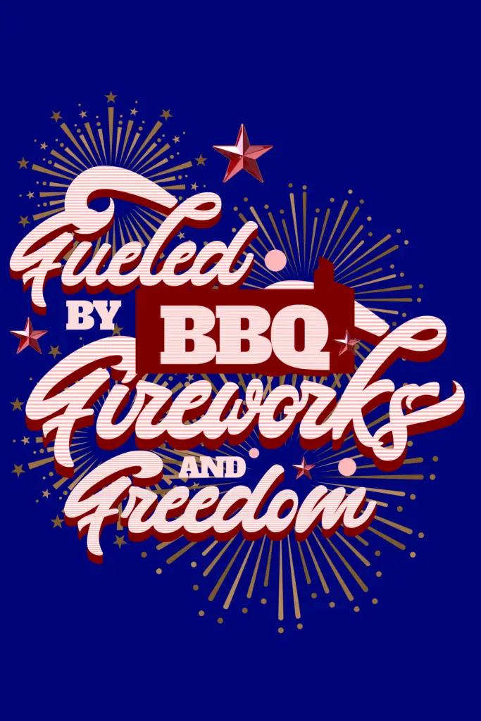
Fueled By BBQ, Fireworks, And Freedom is a vibrant and patriotic graphic celebrating the essence of Independence Day. Set against a rich navy blue background, the text is designed in bold, vintage-inspired script with alternating red and white stripes, evoking the American flag. The words “Fueled By” and “Fireworks” are prominently displayed in an elegant […]
Serene Sunset: Gray Rock Formation Color Palette
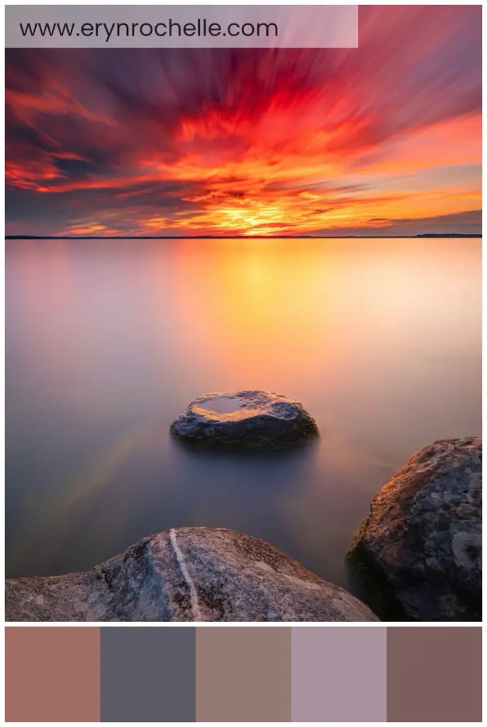
Embrace the serene beauty of nature with this sunset-inspired color palette, featuring warm and cool tones perfect for peaceful and elegant designs.
Luminous Elegance: Light Fixture Color Palette
Discover the sleek and sophisticated elegance of our light fixture color palette, perfect for modern and minimalist designs.
Enigmatic Jellyfish Glow Color Palette
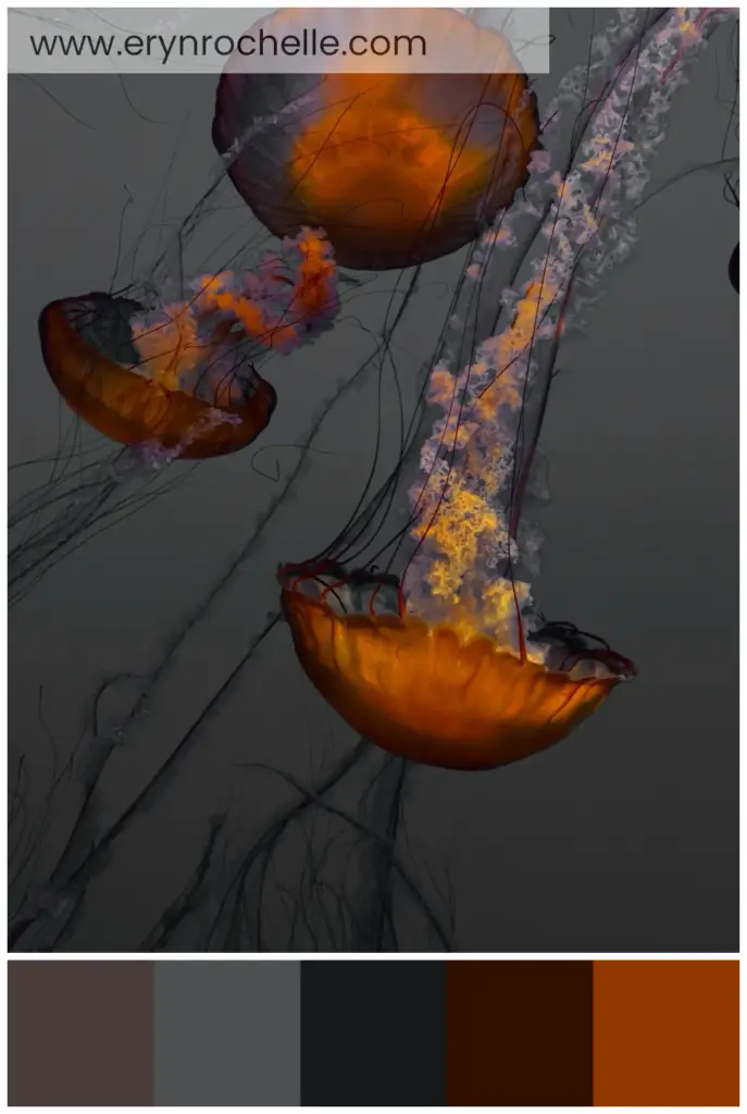
Dive into the mesmerizing depths of the ocean with this enchanting jellyfish-inspired color palette, perfect for adding drama and intrigue to any space.
Tranquil Night Sky and Sea Color Palette
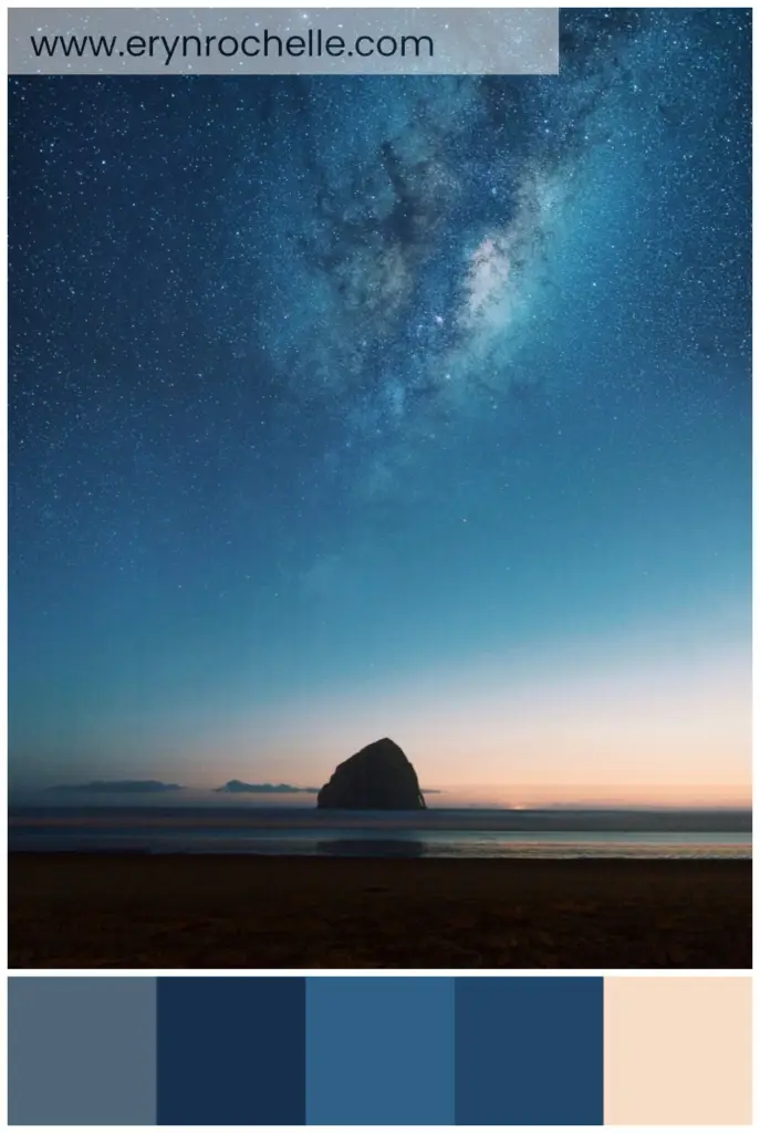
Capture the serene beauty of a calm sea under a starry night sky with this tranquil color palette, perfect for creating a peaceful and sophisticated atmosphere.
Lush Greenery and Earthy Elegance Color Palette
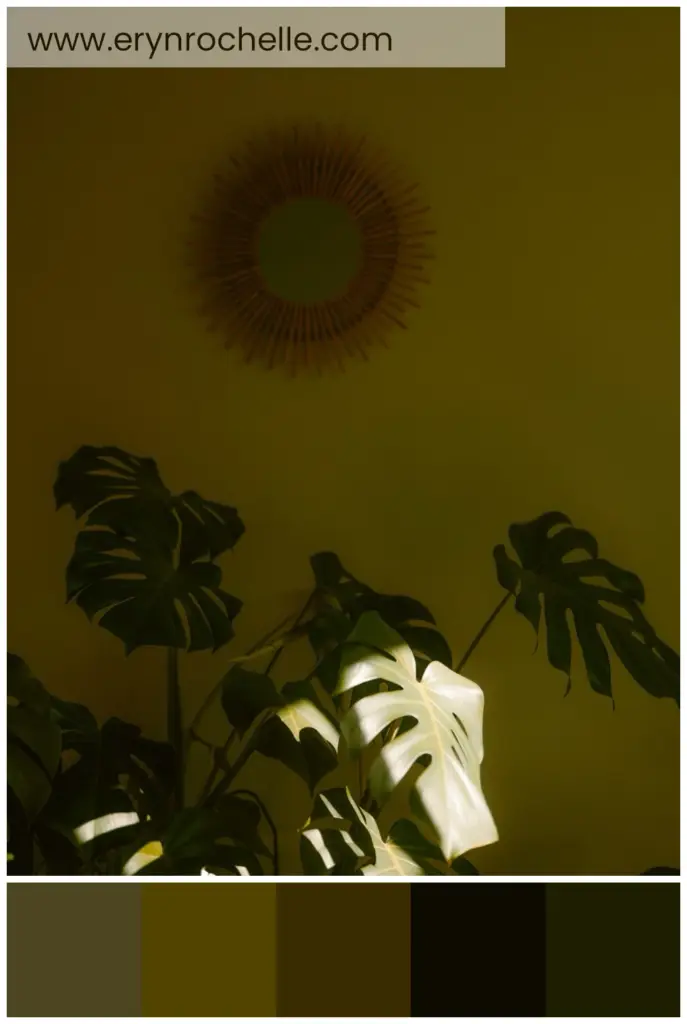
Embrace the tranquility of nature with this lush greenery and earthy elegance color palette, perfect for creating a calm and inviting space.
Captivating Florals: A Luxurious Purple Color Palette
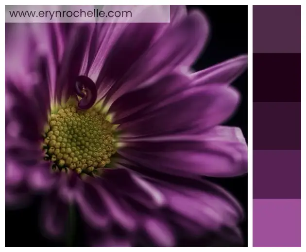
Step into a world of enchanting florals with this luxurious purple color palette. Capturing the delicate beauty of a purple flower in full bloom, this palette offers a rich spectrum of hues, from deep, dramatic shades to bright, lively tones. Perfect for adding a touch of opulence to any design project, these colors evoke elegance and sophistication. Whether you’re working on fashion, interior design, or branding, this palette provides the perfect blend of mystery and refinement. Pair it with gold accents and luxurious fabrics to create a timeless, captivating aesthetic. Embrace the charm of this purple palette and let it inspire your next project.
Geometric Shapes in Design: Visual Interest, Creating Meaning, Organized Layout
Geometric shapes in design create visual interest, convey meaning, and aid in organizing layouts. Understanding psychological effects, maintaining balance, and using shapes as containers are key tips for leveraging geometric shapes effectively in designs. Examples like the Twitter and Microsoft logos demonstrate the power of geometric shapes in creating meaningful and visually appealing designs. Happy designing!
Customizing Privacy Settings: Safeguarding Your Digital Presence

Customizing privacy settings is vital in the digital landscape for data protection and controlled sharing. Social media and web browsers offer options for profile visibility, tagging control, and managing cookies. Device privacy settings govern location services and app permissions. Regularly reviewing and updating settings ensures a safe online experience.
Symmetry in Design: Aesthetical Appeal, Easy Processing, Professionalism
Symmetry in design creates aesthetical appeal, enhances professionalism, and is easy on the eye. Achieving balance through alignment, mixing symmetric and asymmetric elements, and paying attention to negative space are essential for symmetrical designs. Examples like the ‘McDonald’s’ and ‘Mercedes Benz’ logos showcase the power of symmetry in creating visually pleasing compositions. Happy designing!
Design Consistency: Professionalism, Recognition, Trust and Familiarity
Design consistency in graphic design exudes professionalism, aids in brand recognition, and builds trust with viewers. Establishing guidelines, maintaining uniformity in size and placement, and utilizing repetition are key strategies for achieving design consistency. Examples like ‘McDonald’s’ and ‘Turban Kabab House’ logos showcase the impact of consistency in successful branding. Happy designing!
Typography in Graphic Design: Communication, Personality, User Experience
Typography in graphic design is crucial for communication, conveying personality, and enhancing user experience. Selecting fonts wisely, establishing hierarchy, and paying attention to spacing are key tips for effective typography. Examples like ‘Netflix’ and ‘Coca-Cola’ demonstrate the impact of typography in creating visually appealing and engaging designs. Happy designing!
Color Psychology in Graphic Design: Mood and Interpretation, Increased Recall, Brand Perception
Color psychology in graphic design influences mood, enhances recall, and shapes brand perception. Understanding color symbolism, considering audience backgrounds, and keeping color palettes simple are key tips for utilizing color psychology effectively. Examples like ‘Coca-Cola’ and ‘Starbucks’ demonstrate the power of colors in evoking specific emotions and perceptions in designs. Incorporating color psychology elevates designs into emotionally engaging narratives. Happy designing!
Scalability in Graphic Design: Versatility, Quality Preservation, Cost-Effectiveness
Scalability in graphic design offers versatility, quality preservation, and cost-effectiveness. Using vector graphics, considering space, and testing different sizes are key tips for creating scalable designs. Examples like the ‘Nike’ and ‘Facebook’ logos showcase the impact of scalability in maintaining design effectiveness across various platforms and sizes. Embracing scalability enhances design adaptability and longevity. Happy designing!
Inclusive User Experience: Personalizing Accessibility for Universal Interaction
Personalizing accessibility features is crucial for inclusivity in the digital space. Visual adjustments like font size and magnification aid visual impairments, while audio adjustments like captioning assist the hearing impaired. Physical accessibility features and voice assistants enhance interaction for users with motor or communication challenges. Ethical considerations include data privacy and user consent.
Animation in Graphic Design: Engagement, Visual Storytelling, Enhanced User Experience
Animation in graphic design enhances engagement, enables visual storytelling, and improves user experience. Tips for creating animations include mastering animation tools, focusing on timing, and storyboarding sequences. Examples like ‘Google Doodles’ illustrate the enchanting impact of animation. Incorporating animation elevates designs into dynamic narratives, engaging viewers with captivating experiences. Happy designing!
Grids in Graphic Design: Structure and Consistency, Guided View, Efficient Creation

Design grids bring structure, consistency, and efficiency to graphic design, guiding viewers intuitively and streamlining the creation process. Tips for using grids include selecting the right grid for design needs, aligning elements, and creatively breaking the grid for visual interest. Examples like the ‘Swiss Style’ showcase the impact of design grids in creating well-balanced compositions. Harnessing the power of grids elevates design mastery and clarity. Happy designing!
Dynamic Screensavers: Personalization Tips for an Entertaining Idle Screen
Screensavers have evolved into digital expressions, offering entertainment, aesthetics, and information on idle screens. Windows allows customized photo slideshows and animations, while macOS features drift and aerial screensavers. Live wallpapers on Android and dynamic desktop on MacOS provide active backdrops. Balance performance and distraction when customizing screensavers for a dynamic digital experience.
Power of Minimalism in Design: Focus on Essentials, Timeless Appeal, and User-Friendly Experience
Minimalism in design emphasizes core messages, offers timeless appeal, and enhances user experience. Tips for minimalist designs include embracing white space, simplifying elements, and prioritizing functionality. Examples like the ‘Apple’ and ‘Google’ logos showcase the impact of minimalism. Incorporating minimalism elevates design impact, clarity, and coherence, creating compelling visual narratives. Happy designing!
Power of Geometric Shapes in Graphic Design: Visual Harmony, Subconscious Impressions, and Streamlined Communication
Geometric shapes in graphic design bring visual harmony, convey subconscious impressions, and streamline communication. Tips include understanding shape associations, maintaining balance, and combining shapes creatively. Examples like the ‘Target’ and ‘Microsoft’ logos demonstrate effective use of geometric shapes. Incorporating geometric shapes enhances design depth and engages viewers both visually and subconsciously. Happy designing!