
The Magic of Scale: Enhancing Visual Impact, Establishing Hierarchy, and Creating Contrast in Graphic Design

Scale in graphic design significantly impacts visual impact, hierarchy, and contrast. Tips include planning visual hierarchy early, relating sizes to real-world objects, and experimenting with scale for striking designs. Examples like Apple’s ads show effective use of scale. Incorporating scale allows for storytelling, focus control, and rhythm creation in designs. Happy designing!
The Art of Negative Space: Enhancing Composition, Focusing Attention, and Sparking Creativity in Graphic Design

Negative space in graphic design offers clarity, focuses attention on key elements, and inspires creativity through innovation. Tips include minimal design for productive negative space use, purposeful element placement, and creating double imagery for intrigue. Recognizable designs like the FedEx logo showcase the power of negative space. Embracing negative space fosters design experimentation and pushes creative boundaries for impactful storytelling. Happy designing!
Living Lines: Guiding Direction, Crafting Forms, and Defining Boundaries in Graphic Design

Lines in graphic design guide viewer direction, shape forms, and define boundaries to enhance clarity and focus. Tips include playing with line variety and stylization, using lines for effects like depth and division, and creating purposeful designs. Examples like the Google logo highlight the central role lines play in design impact. Incorporating lines into designs amplifies creativity, making the canvas a space for innovation and visual storytelling. Happy designing!
Designing Your Device Flow: Personalizing Home Screens and App Grids for Efficiency and Expression

Customizing home screens and app grids on devices offers convenience, productivity, and personal expression. Android provides flexibility with freeform layouts, widgets, and third-party launchers. iOS 14 enhances customization with App Library, widgets, and custom app icons. Organize apps based on frequency and categories, maintain a clean layout for efficiency. Personalized screens can promote digital wellbeing and mindfulness.
Creating Cohesive Designs: Unity, Branding, and Clarity through Consistency in Graphic Design
Consistency in graphic design fosters unity, reinforces branding, and ensures a clear message for the audience. Tips include maintaining a consistent color scheme, typeface, fonts, and style of imagery. Examples like Apple’s design language highlight the impact of consistency on successful designs. Embracing consistency shapes the creative process for visually coherent and conceptually clear creations. Happy designing!
The Trilogy of Design: Mastering Emphasis, Achieving Balance, and Creating Harmony in Graphic Design

Emphasis, balance, and harmony are key elements in graphic design, guiding viewer focus, ensuring visual stability, and creating cohesive compositions. Tips include designating a focal point, observing visual weight for balance, and maintaining consistent themes for harmony. Successful designs like Starbucks’ logo showcase the power of this trinity in creating visually appealing compositions. Incorporating these elements enhances creativity and design skills, transforming blank canvases into captivating visual stories. Happy designing!
Decoding Design: Demystifying Target Audience, Inspiring Creativity, and Enhancing Understanding through Research

Research in graphic design demystifies the target audience, inspires creativity, and leads to an all-round understanding, enhancing design impact. Tips for thorough research include exploring the brand, staying updated on trends, and studying the competition. Successful designs like the Apple logo demonstrate the value of research in design creation. Incorporating research provides a solid foundation for well-informed visual solutions, elevating designs to cater effectively to audience desires. Happy designing!
Speaking Fluent Font: Conveying Tone, Enhancing Readability, and Building Brand Identity through Typography
Typography in graphic design conveys tone, boosts readability, and enhances brand identity through different typefaces and sizes. Tips include using contrasting typefaces, strategic sizing for text hierarchy, and appropriate spacing for improved readability. Examples like ‘The New Yorker’ magazine showcase the power of typography. Embracing typography adds a poetic touch to designs, transforming words into visual elements. Designers are encouraged to explore the vast world of typography for innovative storytelling. Happy designing!
Unfolding the Rhythm: Creating Consistency, Reinforcing Ideas, and Guiding Viewers with Repetition in Graphic Design
Repetition in graphic design creates consistency, reinforces ideas, and guides the viewer’s gaze. Tips include incorporating variation within repetition, consistently using certain elements, and linking related elements for visual connection. Examples like the Adidas logo showcase successful use of repetition. Embracing repetition adds visual rhythm and effectiveness to designs. Designers can leverage repetition to create visually engaging and resonant designs. Happy Designing!
Power of Proportions: Enhancing Cohesion, Informed Placements, and Readability with Grid Systems
Grid systems provide structural cohesion, informed placements, and enhanced readability in graphic design. Tips include choosing the appropriate grid type, maintaining consistency, and breaking free when necessary for emphasis. Examples like Swiss design posters and website layouts showcase the effectiveness of grid systems in establishing harmony. Incorporating grid systems brings reliable structure to design elements. Designers should embrace the controlled beauty of grid systems for foundational support in creating structured and visually appealing designs. Happy designing!
Ingredients of Impact: Guiding the Gaze, Improving Comprehension, and Enhancing Aesthetics with Visual Hierarchy

Visual hierarchy guides the viewer’s gaze, improves comprehension, and enhances aesthetics in graphic design. Tips include using scale and size, color and contrast, and spacing and position to create a proper hierarchical structure. Examples in webpages, logos, and magazine layouts showcase the power of visual hierarchy. Adopting visual hierarchy leads to crafting effective and balanced designs that engage viewers. Designers must command the narrative through visual hierarchy to create designs that are not just viewed but read and understood. Happy designing!
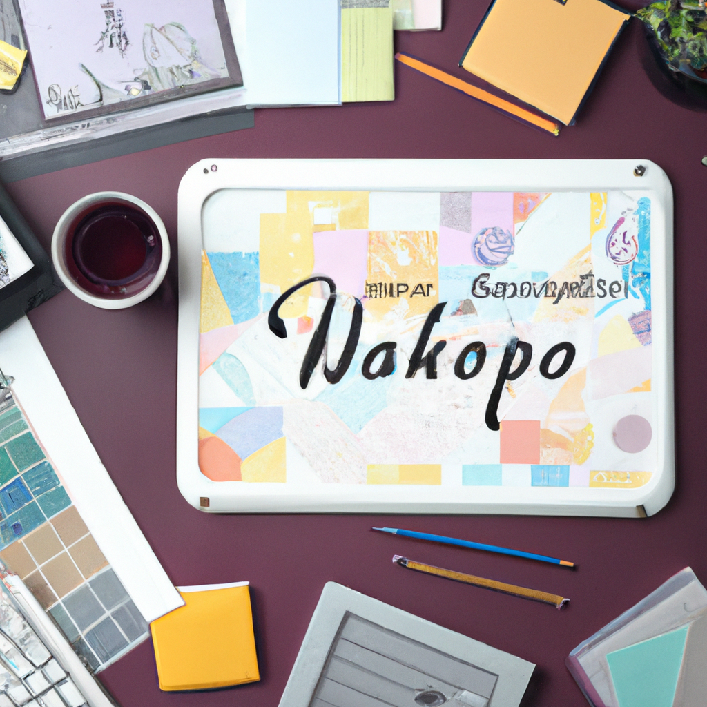
Mockup Challenge Day 30

Join me in the 100-Day Mockup Challenge! I’m creating an Adobe Photoshop mockup every day for 100 days. It’s a fun way to build up a product library and continue to explore new Photoshop tools.
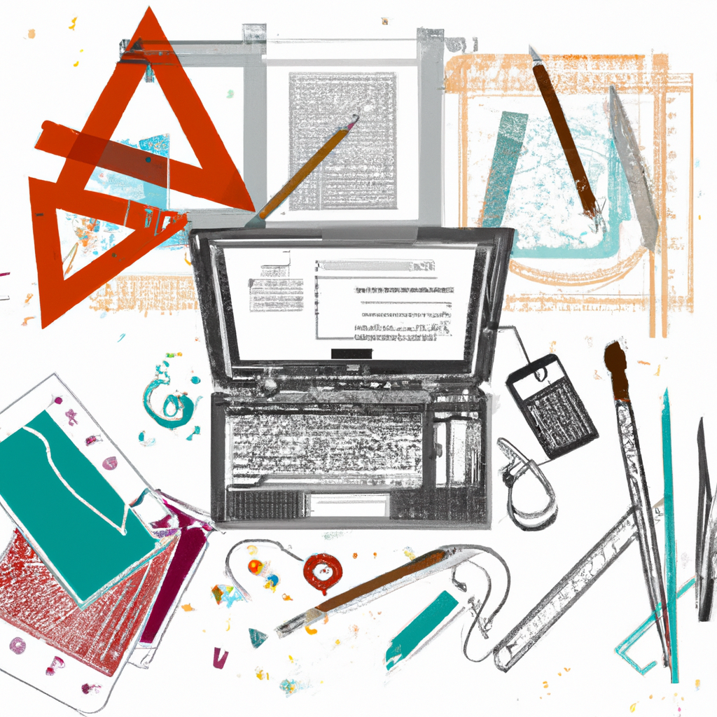
Mockup Challenge Day 29

Join me in the 100-Day Mockup Challenge! I’m creating an Adobe Photoshop mockup every day for 100 days. It’s a fun way to build up a product library and continue to explore new Photoshop tools.
Mockup Challenge Day 28

Join me in the 100-Day Mockup Challenge! I’m creating an Adobe Photoshop mockup every day for 100 days. It’s a fun way to build up a product library and continue to explore new Photoshop tools.
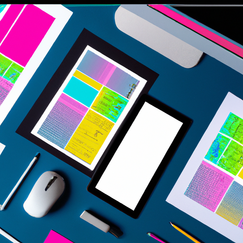
Mockup Challenge Day 27

Join me in the 100-Day Mockup Challenge! I’m creating an Adobe Photoshop mockup every day for 100 days. It’s a fun way to build up a product library and continue to explore new Photoshop tools.
Mockup Challenge Day 26

Join me in the 100-Day Mockup Challenge! I’m creating an Adobe Photoshop mockup every day for 100 days. It’s a fun way to build up a product library and continue to explore new Photoshop tools.
The Art of Negative Space: Revealing the Hidden, Enhancing Clarity, and Guiding the Viewer in Graphic Design

Negative space in graphic design reveals hidden designs, enhances clarity, and guides the viewer’s attention. Tips for using negative space include embracing minimalism, maintaining balance, and using negative space creatively. Examples like FedEx’s hidden arrow and the WWF’s panda showcase the power of negative space. Integrating negative space brings richness and depth to designs. Let’s venture into the sophisticated realm of negative space and transform ordinary compositions into extraordinary narratives. Happy designing!
Customize and Conserve: Balancing Personalization and Battery Performance for Portable Devices

Customizing portable devices provides personalization but can impact battery life. Features like live wallpapers and constantly updating widgets consume more power. Balancing personalization and power conservation can be achieved by limiting widget usage, using dark themes for OLED or AMOLED screens, and adjusting app sync settings. Monitor battery usage with built-in tools or third-party apps. Create a unique and efficient user experience on your device.
Breaking the Ice with White Space: Boosting Legibility, Creating Focus, and Simplifying Design in Graphic Design

White space in graphic design boosts legibility, creates focus, and simplifies the overall visual experience. Tips for mastering white space include striking a balance between empty space and design elements, applying consistent white space, and utilizing both micro and macro white space. Examples like Apple’s website showcase the potency of white space. Embracing white space brings simplicity, grace, and precision to designs. Let’s utilize the power of white space to communicate clarity and create impactful designs. Happy designing!
Mockup Challenge Day 25

Join me in the 100-Day Mockup Challenge! I’m creating an Adobe Photoshop mockup every day for 100 days. It’s a fun way to build up a product library and continue to explore new Photoshop tools.